

FALL WINTER 2027 TREND
VINTAGE GLAMOUR
WELL-WORN
IMPERFECTLY POLISHED
Fall/Winter 2027 looks to the past to create something that feels meaningful for the present. Across both trends, nostalgia becomes a form of escapism, whether that’s expressed through lavish maximalism and romantic glamour or through weathered materials, handcrafted details, and lived-in imperfection.
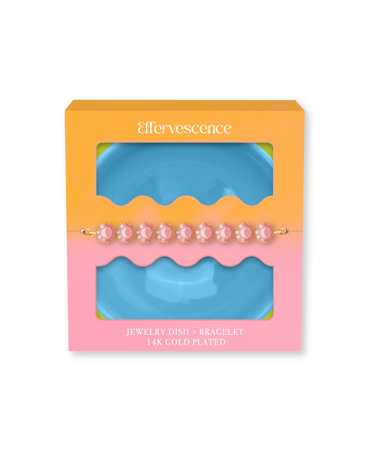
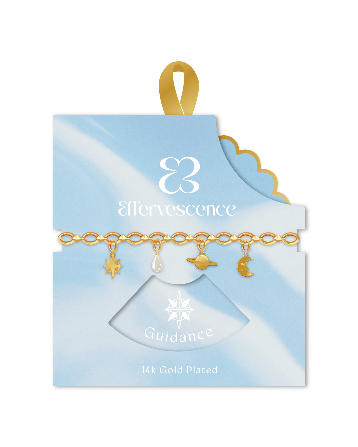
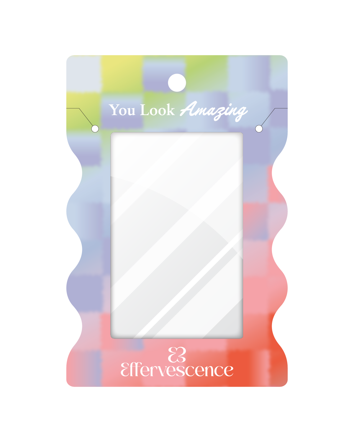
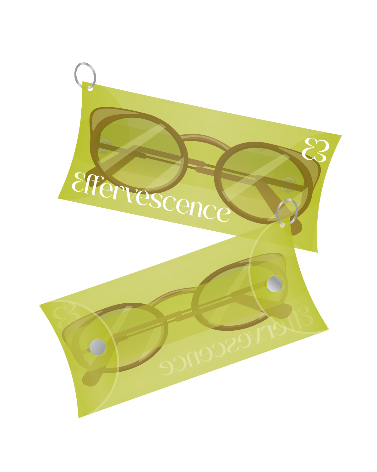
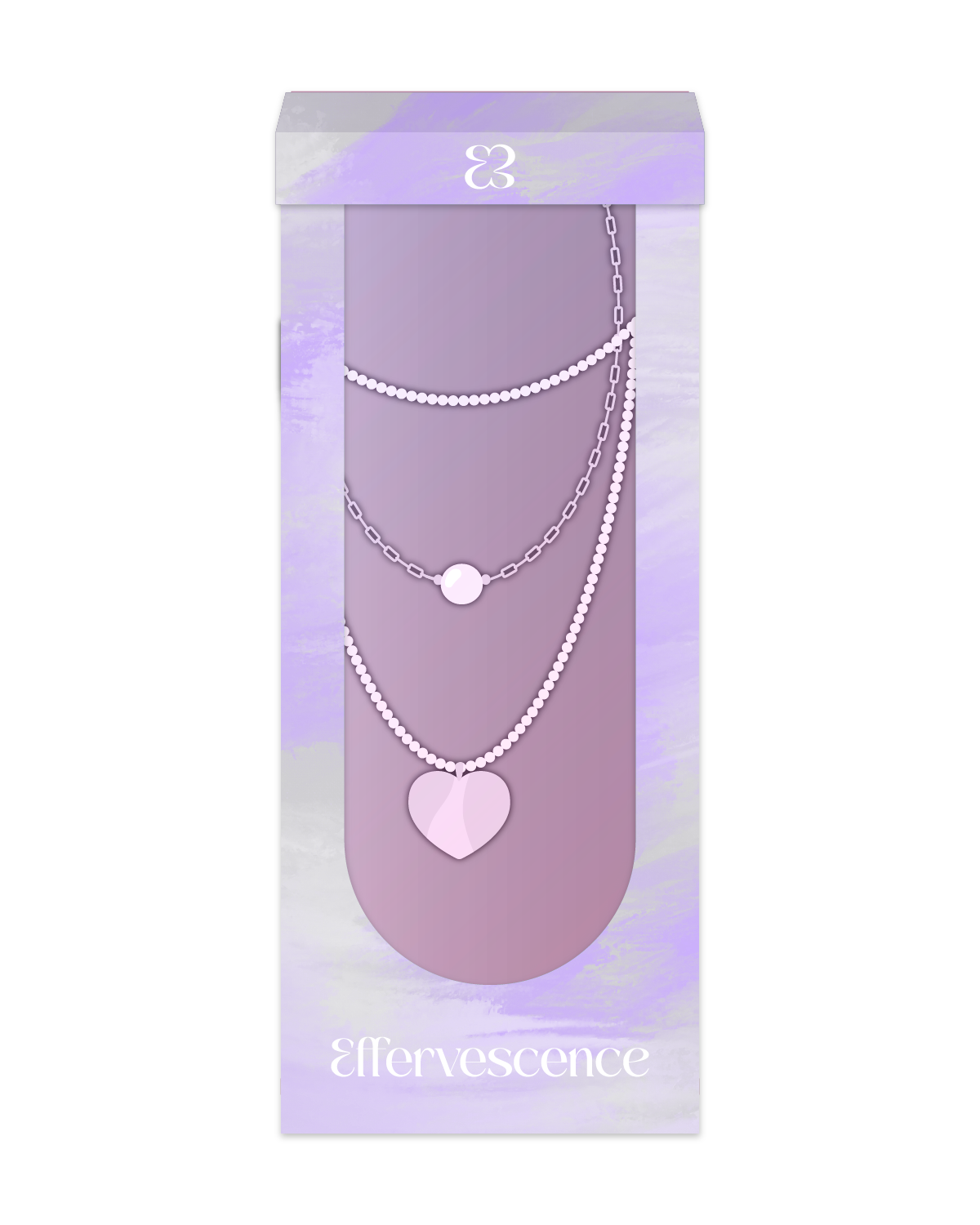
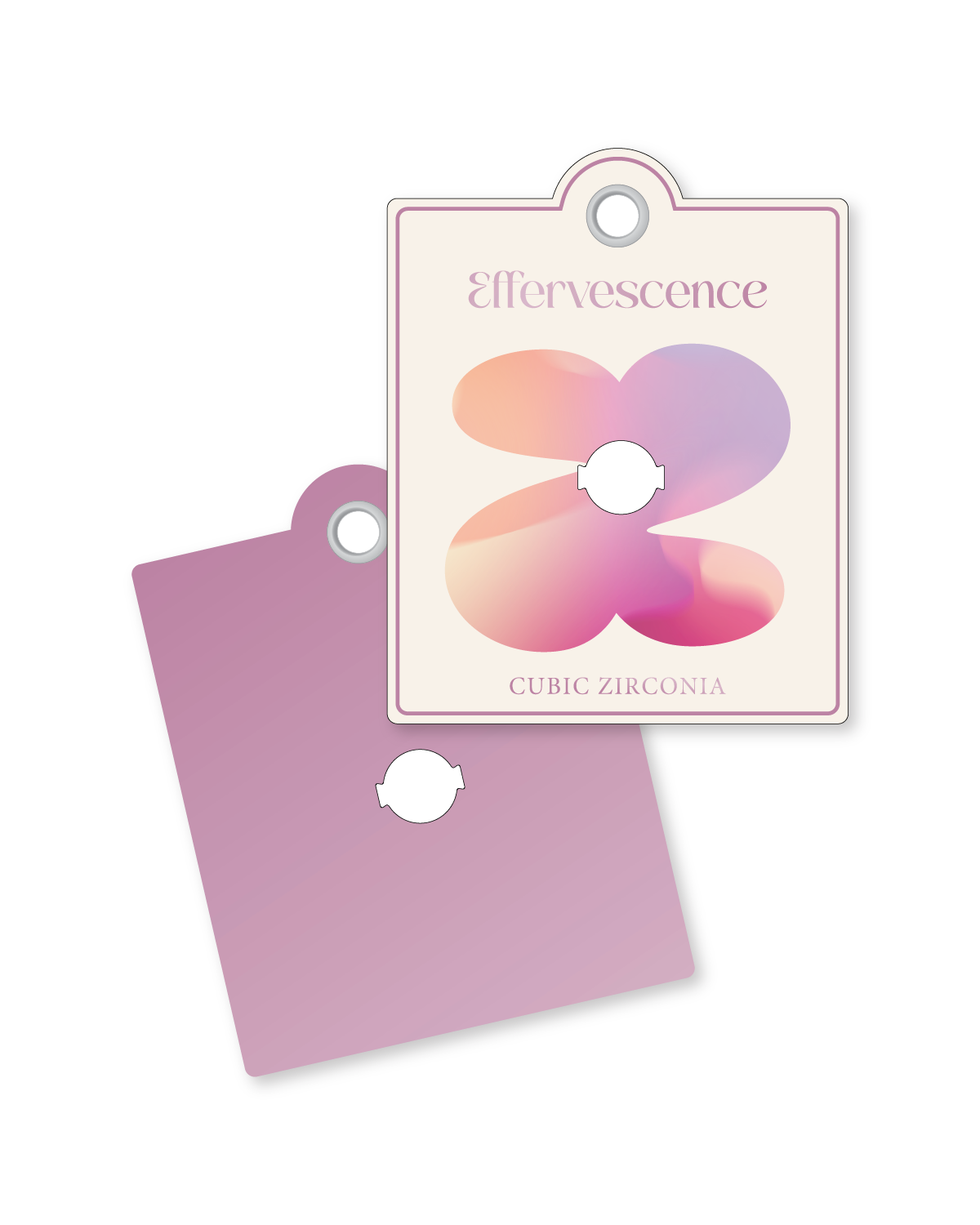
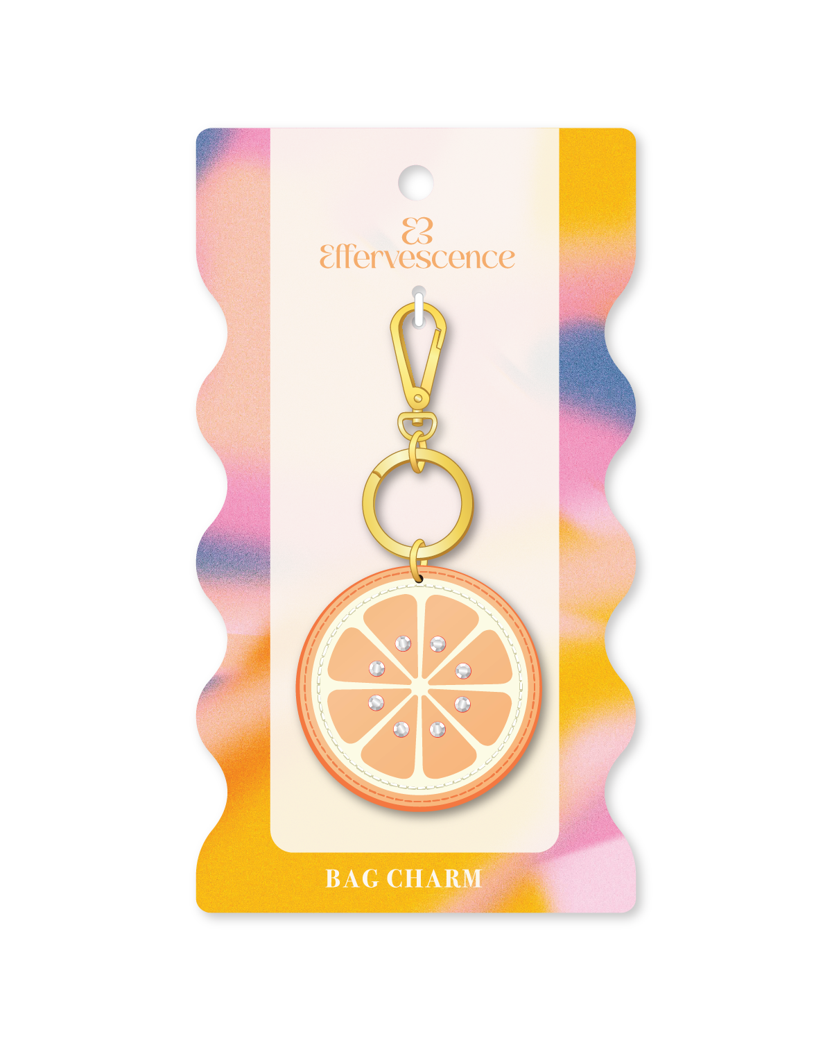
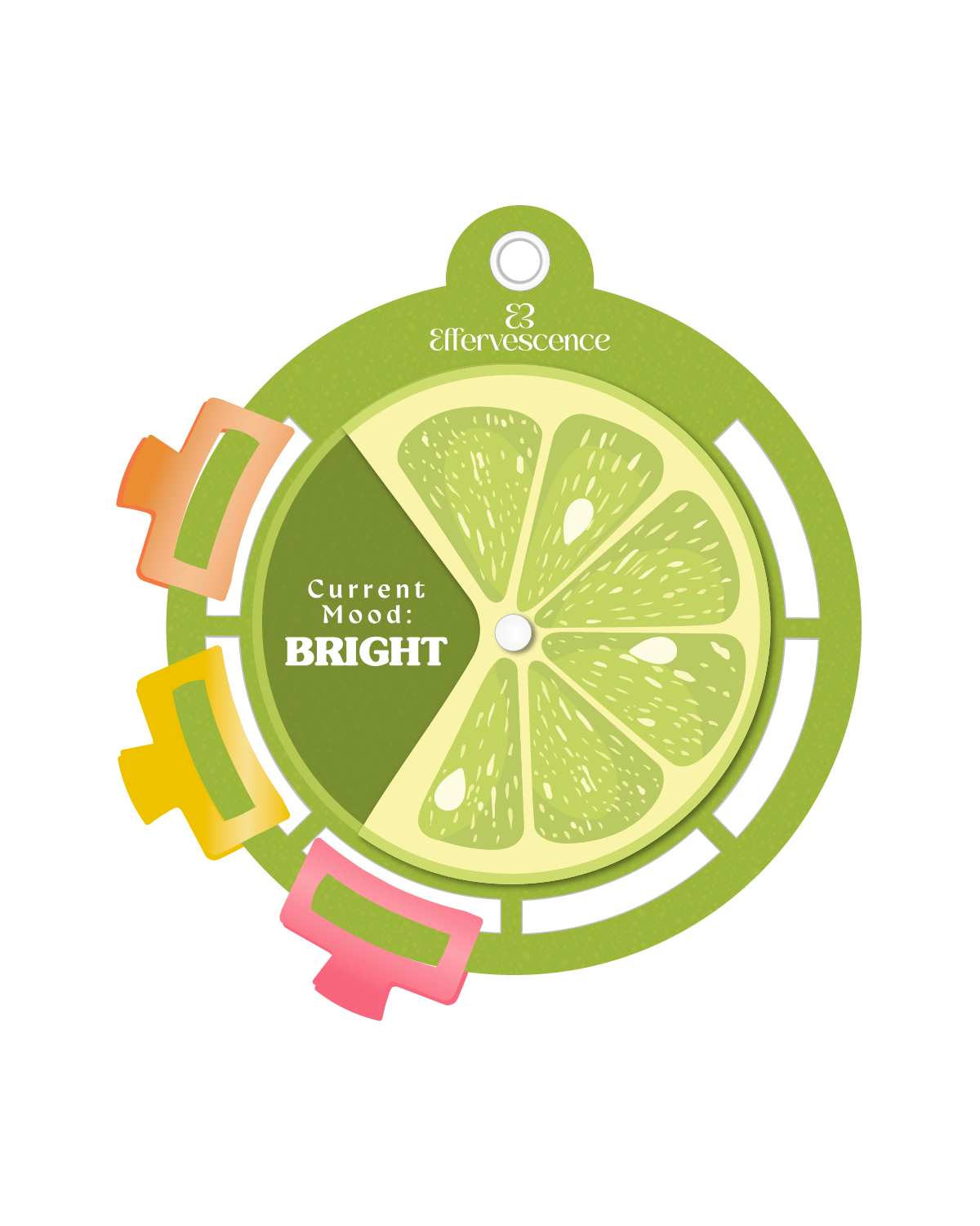
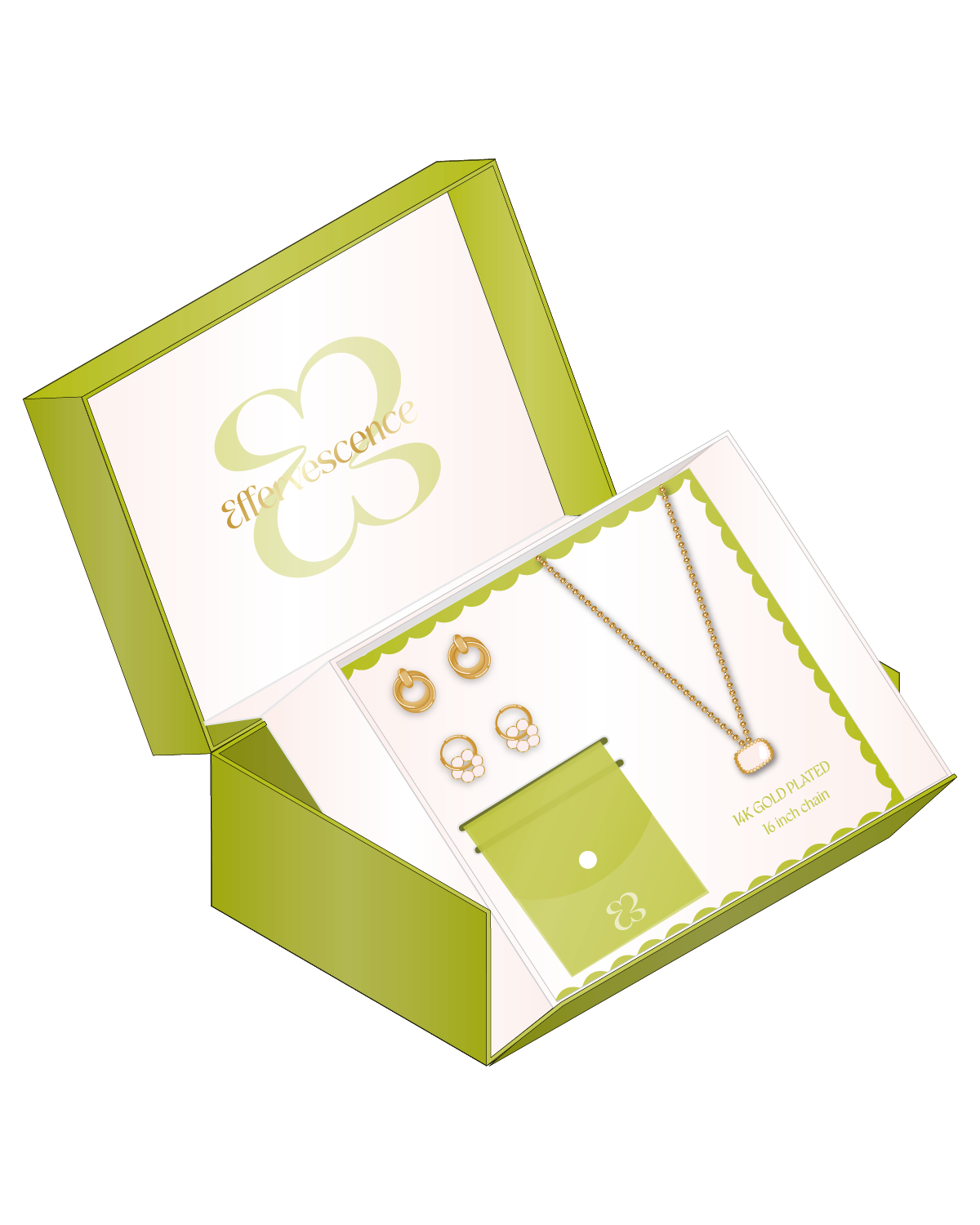
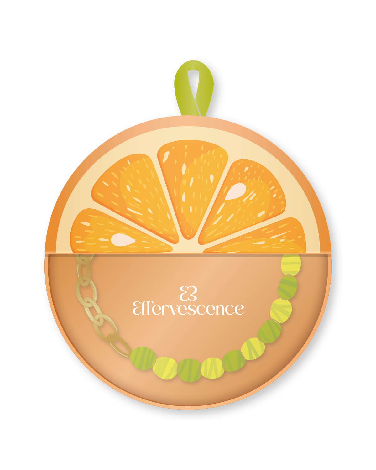
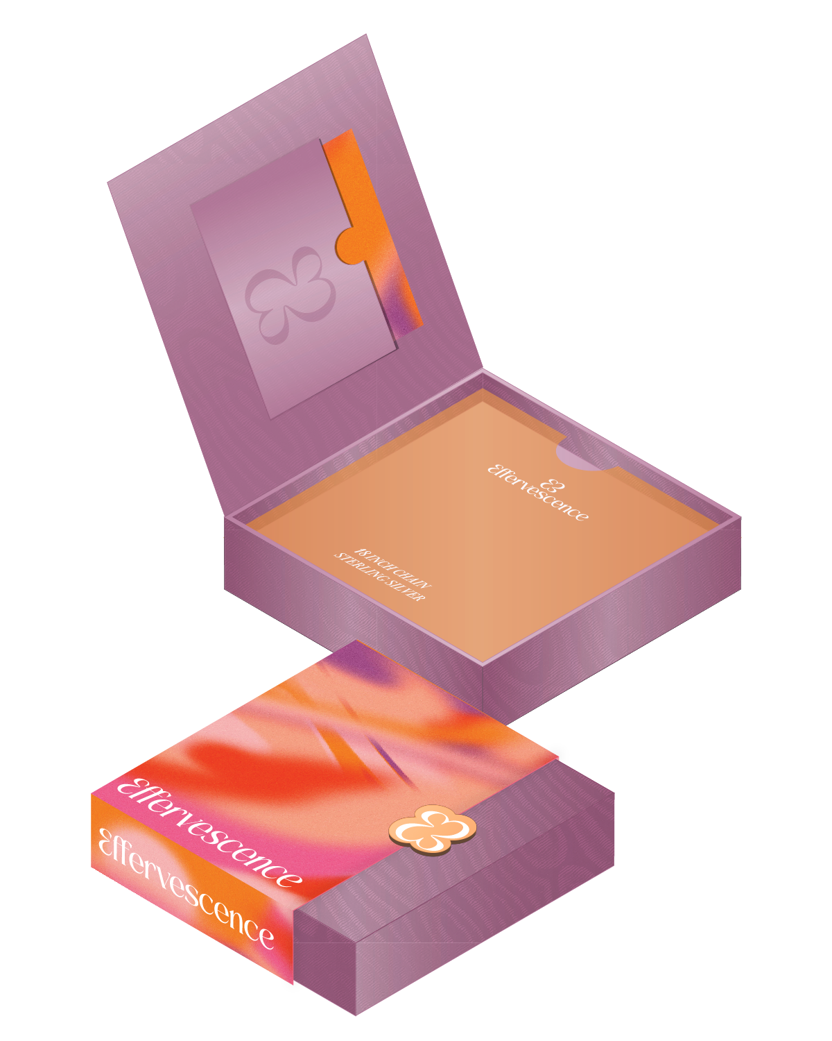
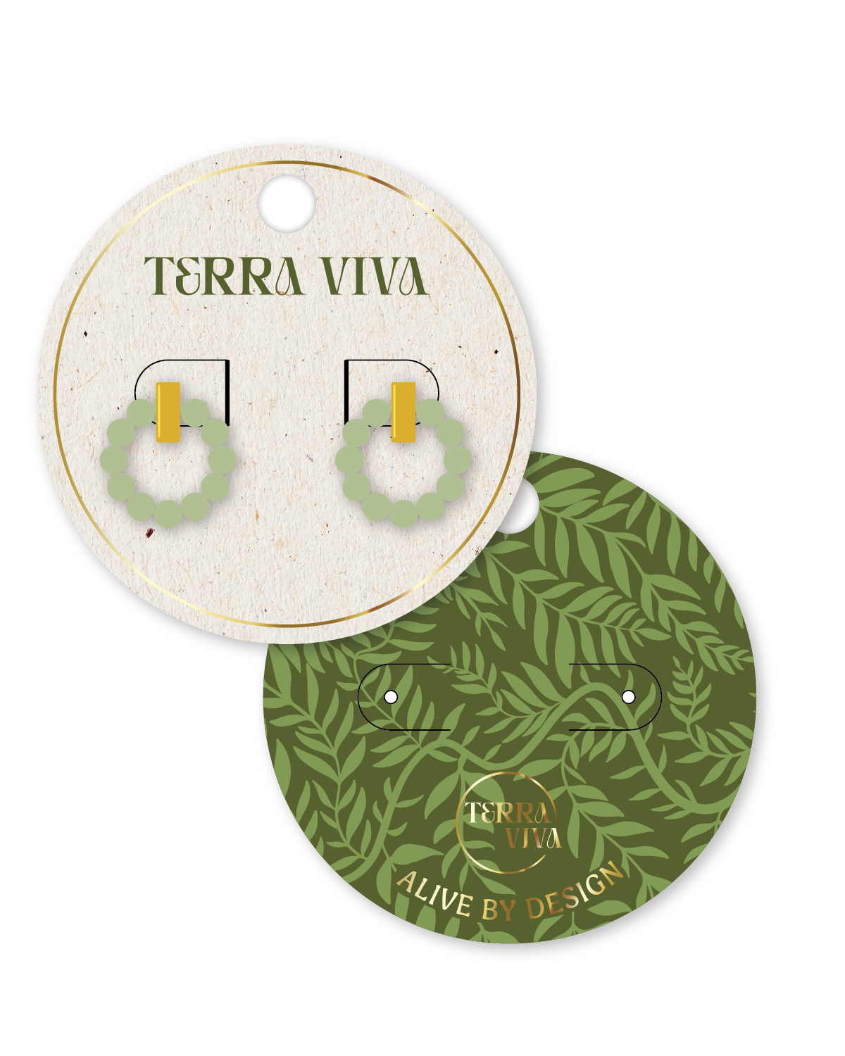
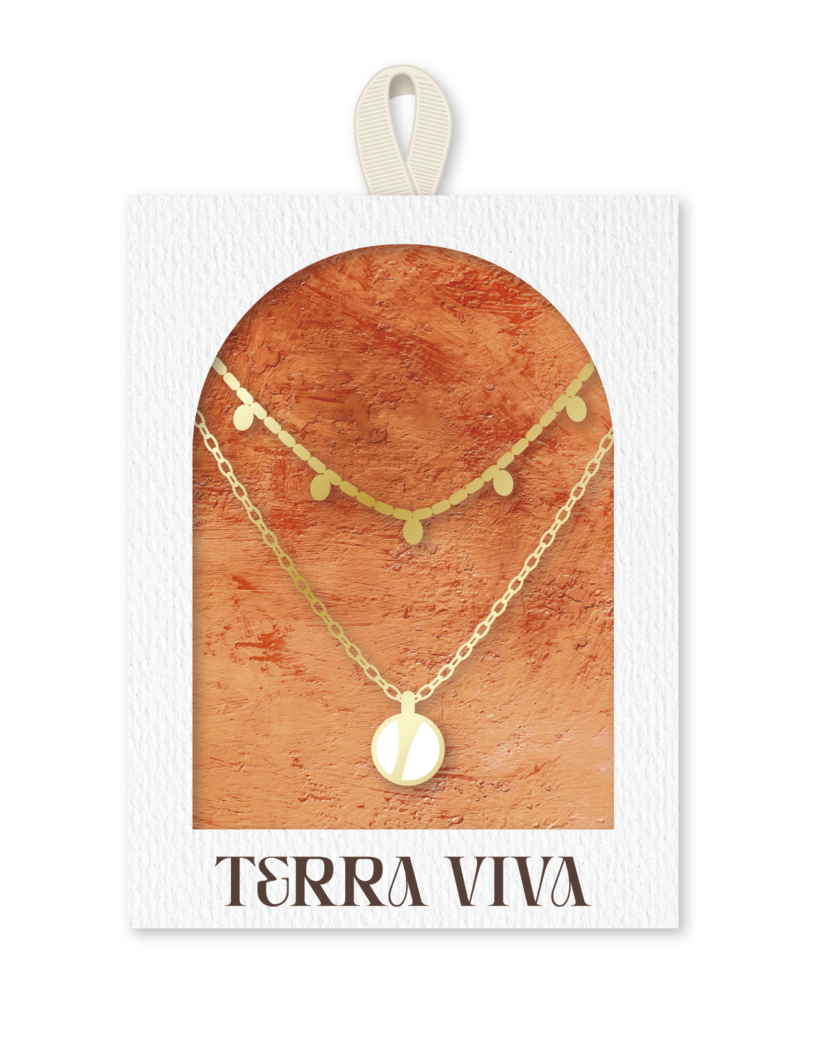
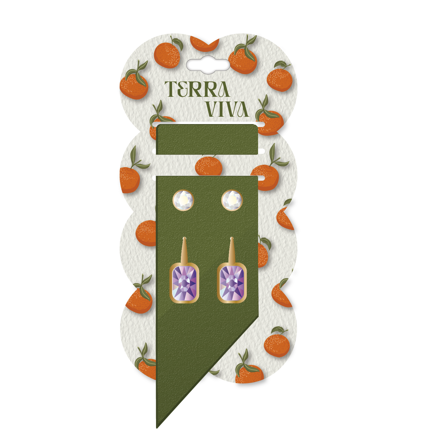
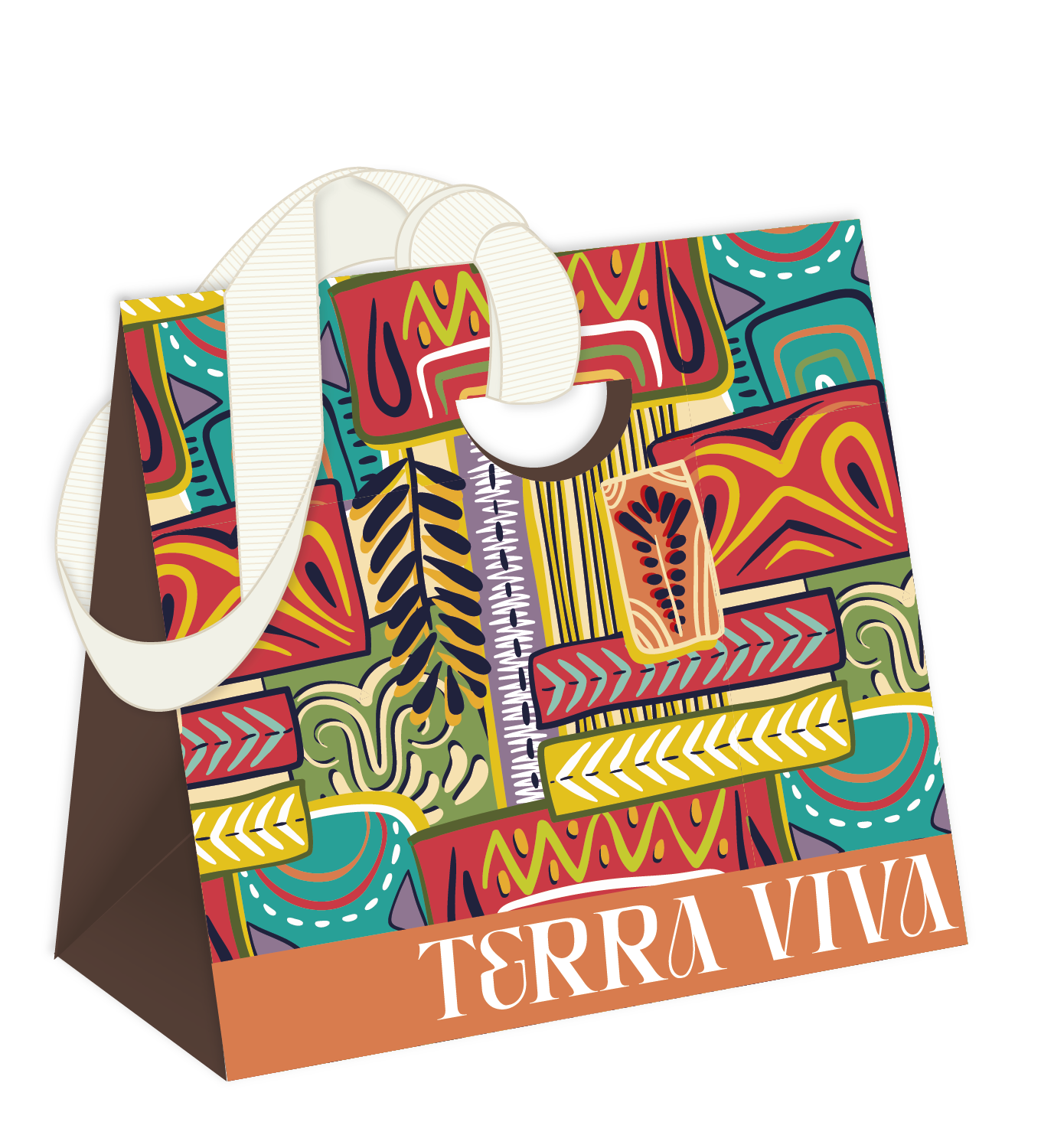
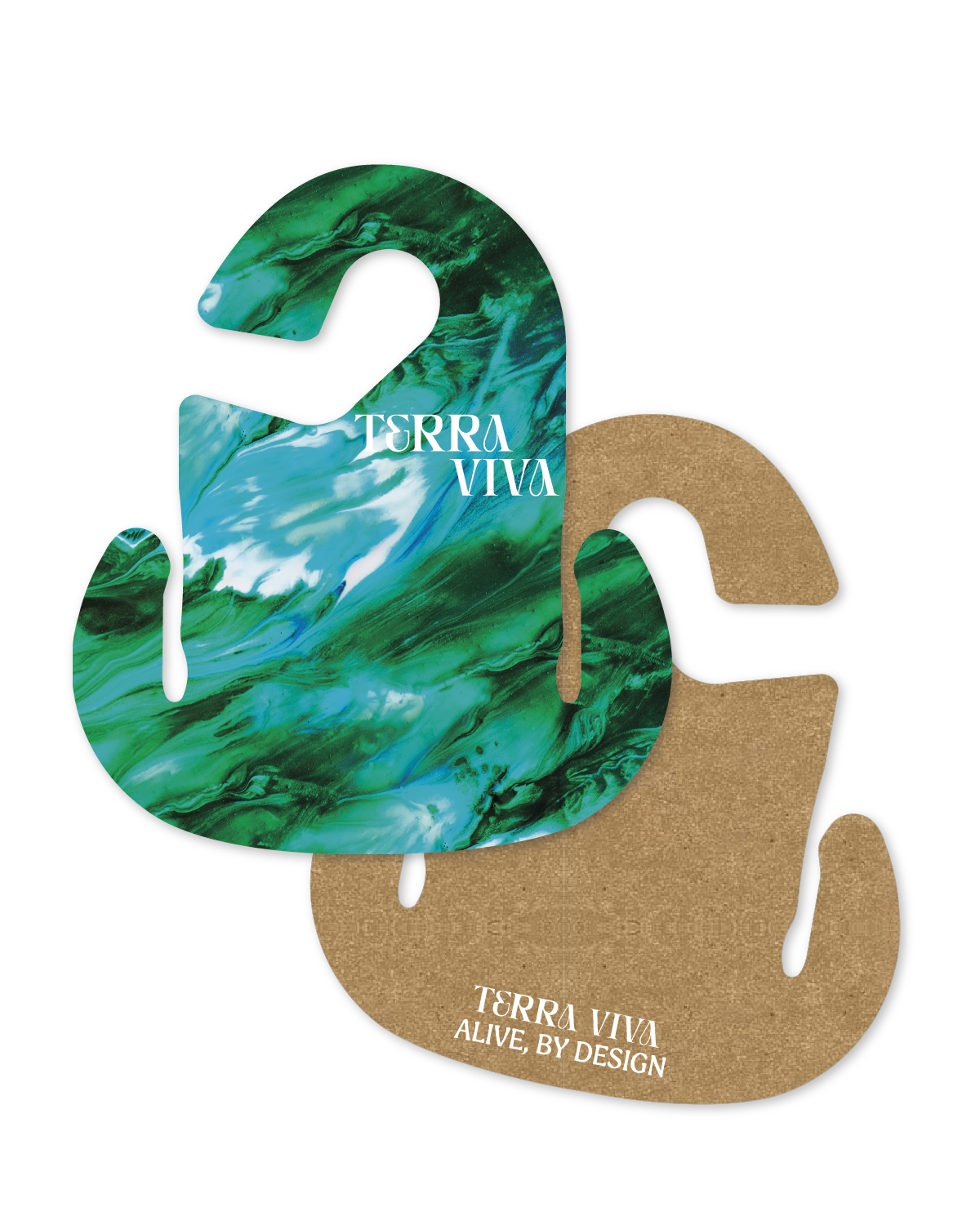
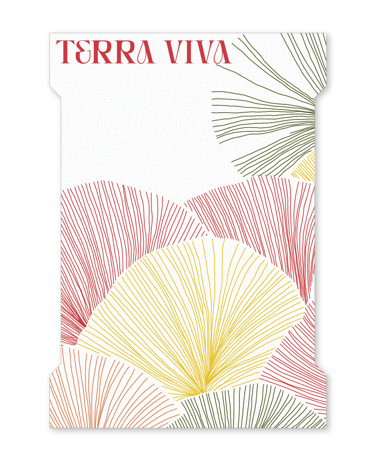
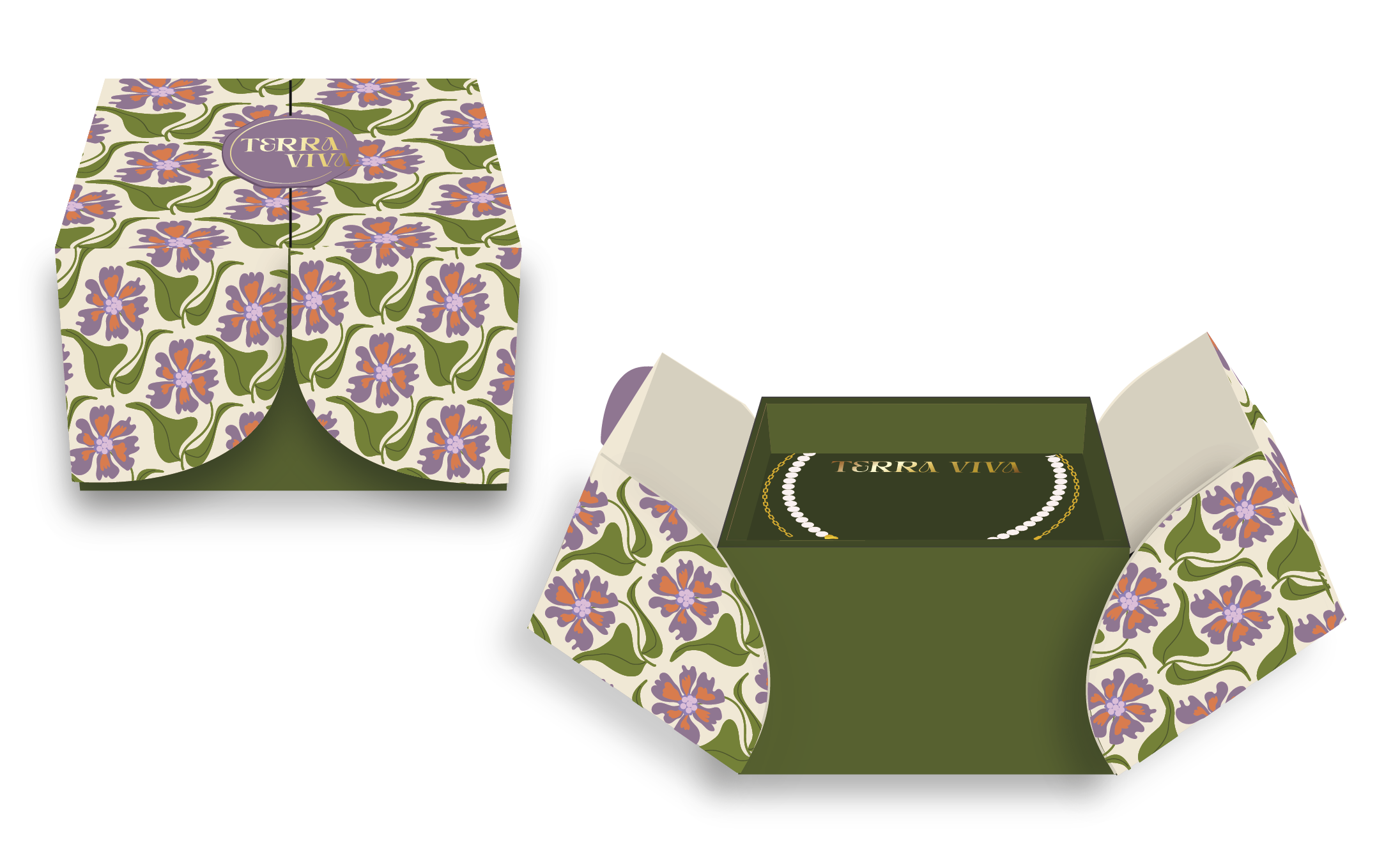
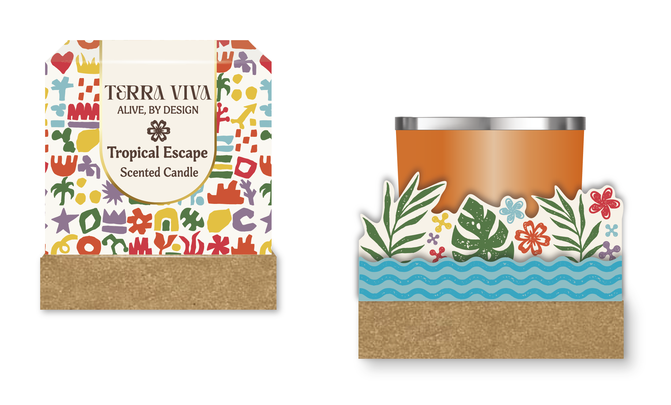
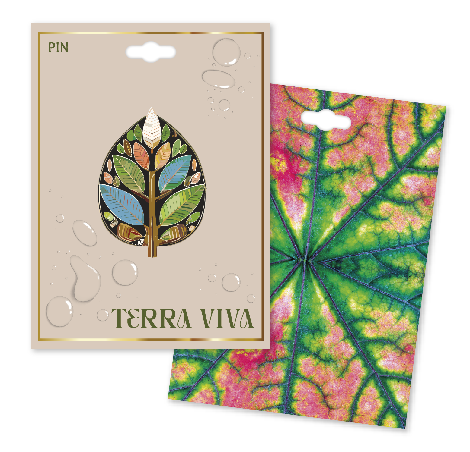
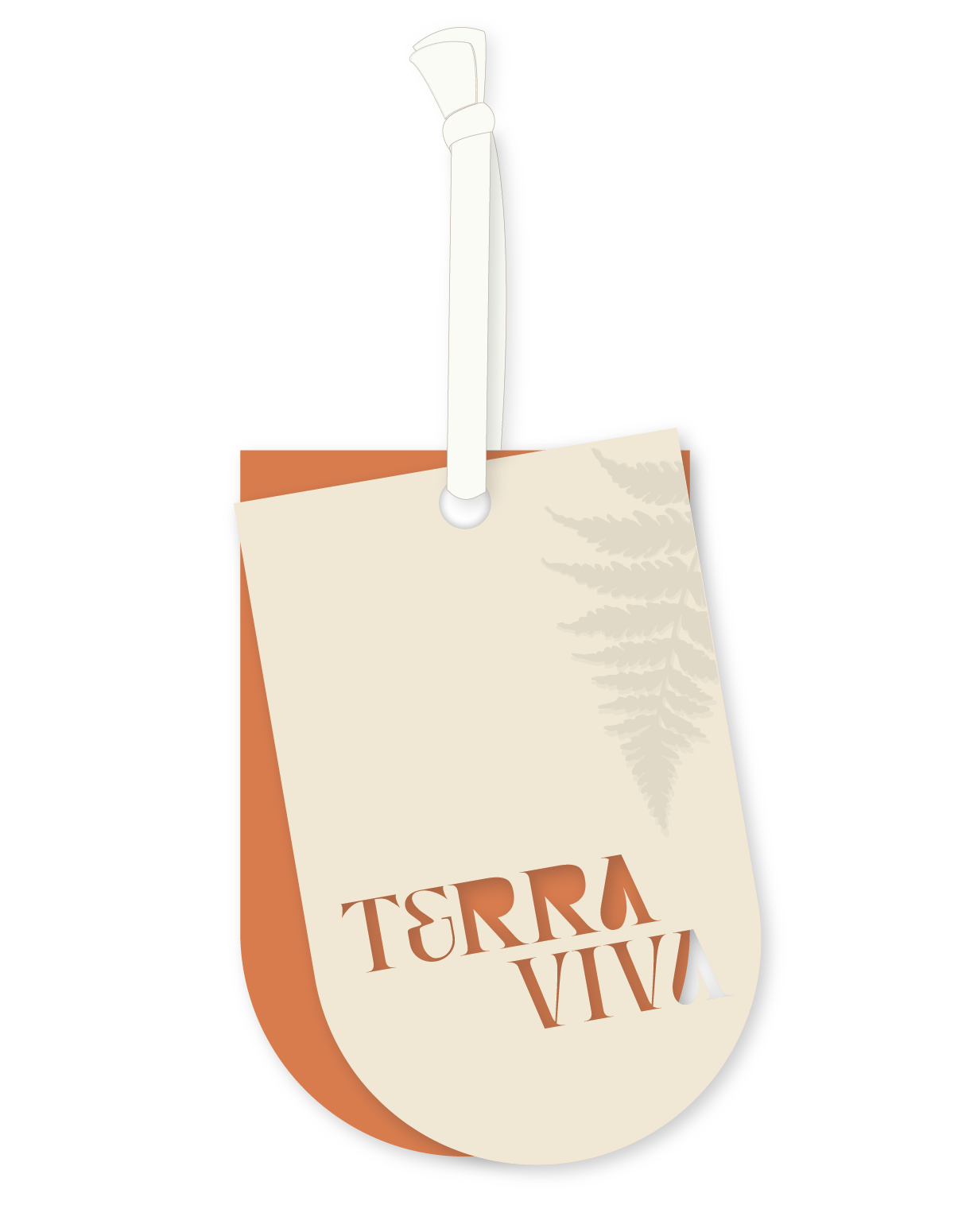
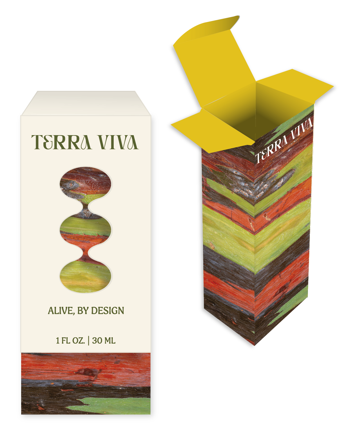
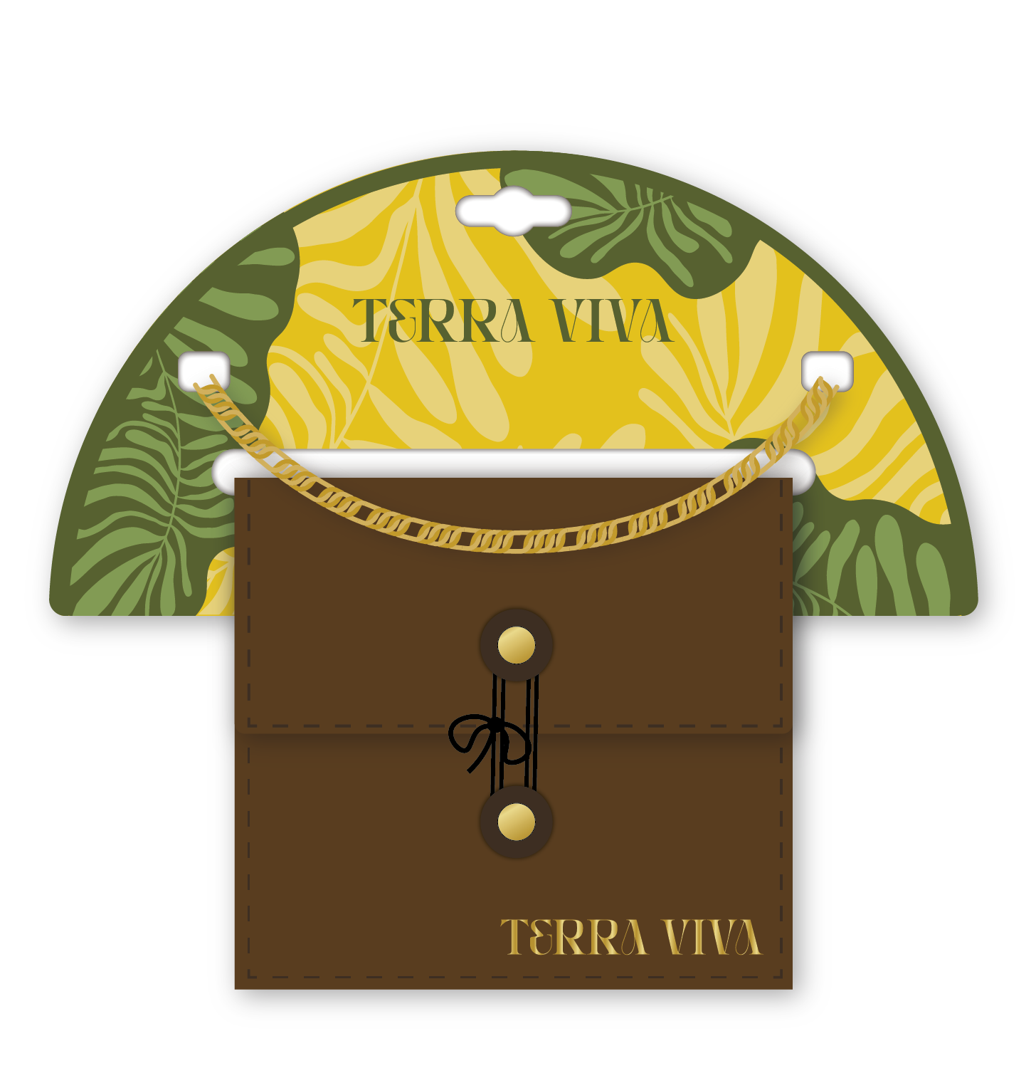
For packaging, this creates an opportunity to move away from designs that feel overly clean or manufactured and toward experiences with greater depth and personality. Metallic finishes, layered embellishments, botanical influences, and handcrafted details can make packaging feel discovered, collected, and most importantly, worth remembering.
Gilded Reverie
OPULENT
ROMANTIC
EMPOWERING
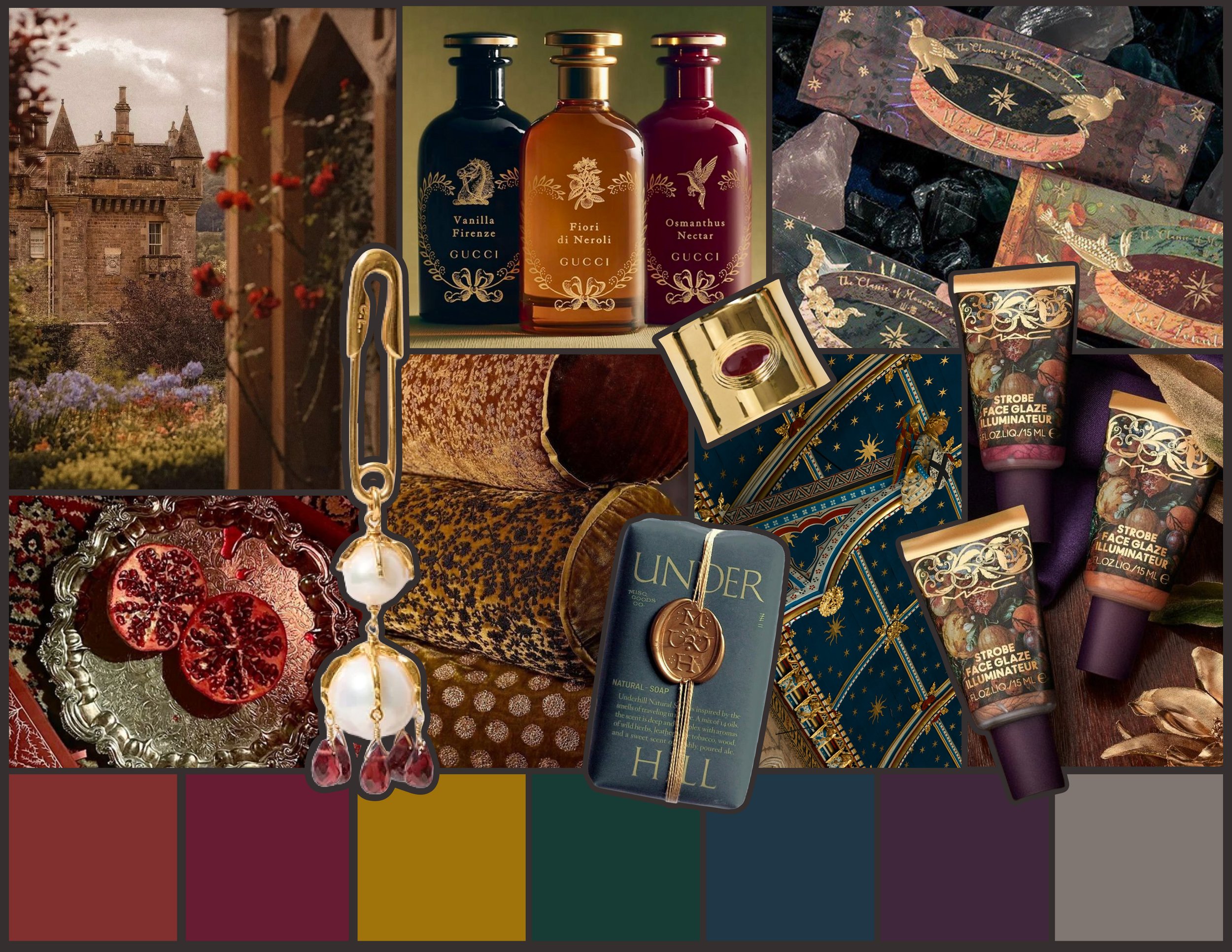
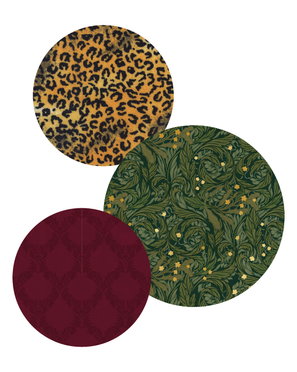
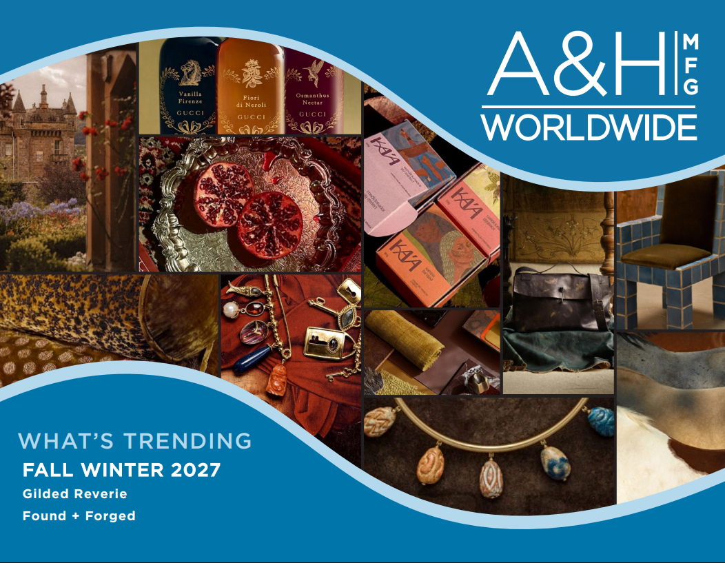
Drawing inspiration from maximalist glamour and medieval romance, Gilded Reverie rejects restraint in favor of drama, abundance, and visual storytelling. Lavish materials and intricate embellishments create a sense of fantasy. Wrought iron, stone, and parchment inspired textures meet velvety finishes and delicate metallic detailing evoke the feeling of unexpected romance. Ornate historical influences are exaggerated and reimagined for consumer looking for something outside the mundane of everyday life. For packaging, more becomes more. Layered patterns, ornate typography, and unexpected embellishments transform the packaging into a spectacle itself.
COLOR PALETTE
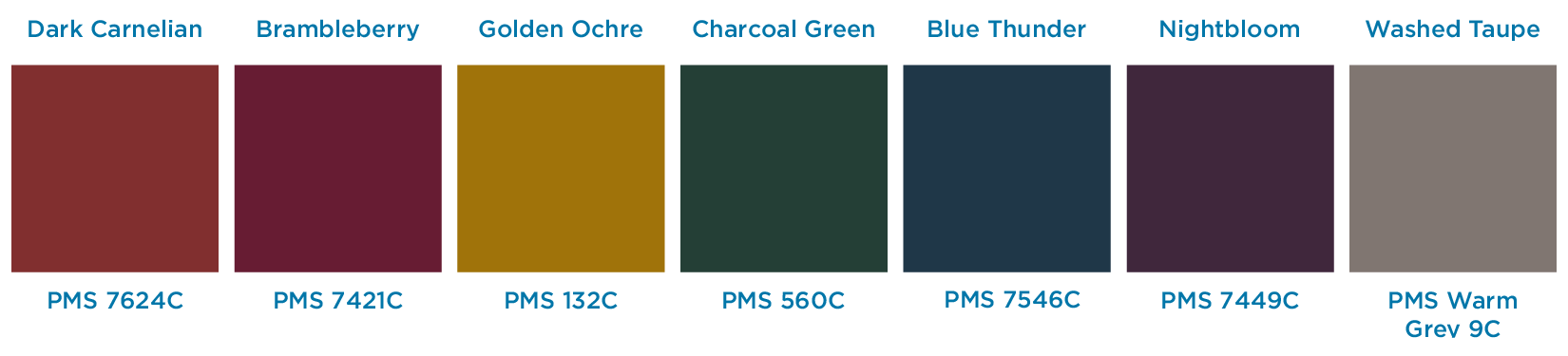
Gilded Reverie’s core colors are rich, romantic, and illuminated. Deep saturated colors inspired by velvet, candlelit interiors, and historic tapestries create the foundation of the palette. Romantic jewel tones provide depth, while metallic accents introduce moments of light and opulence. Rather than relying on bright and highly polished metallics, brushed and aged finishes can create a more sophisticated glow. The result is a palette that feels dramatic and luxurious without losing its sense of history
Found + Forged
ENDURING
IMPERFECT
LIVED-IN
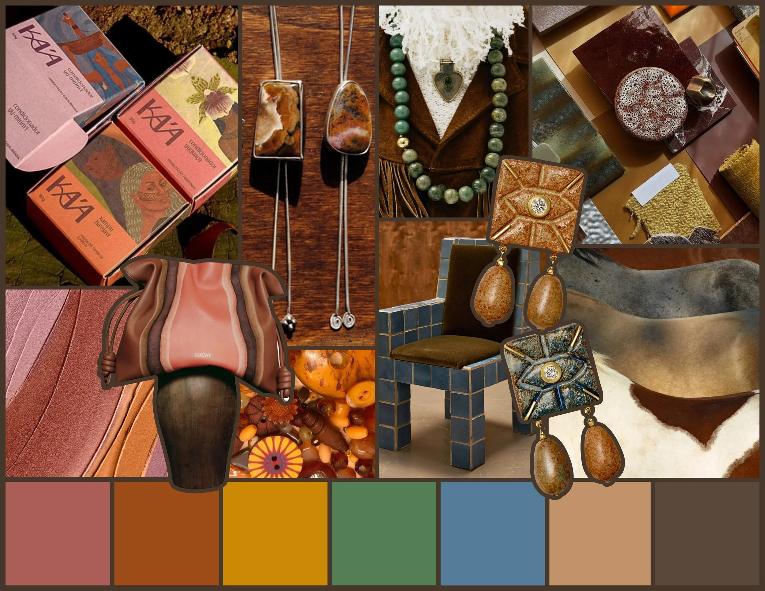
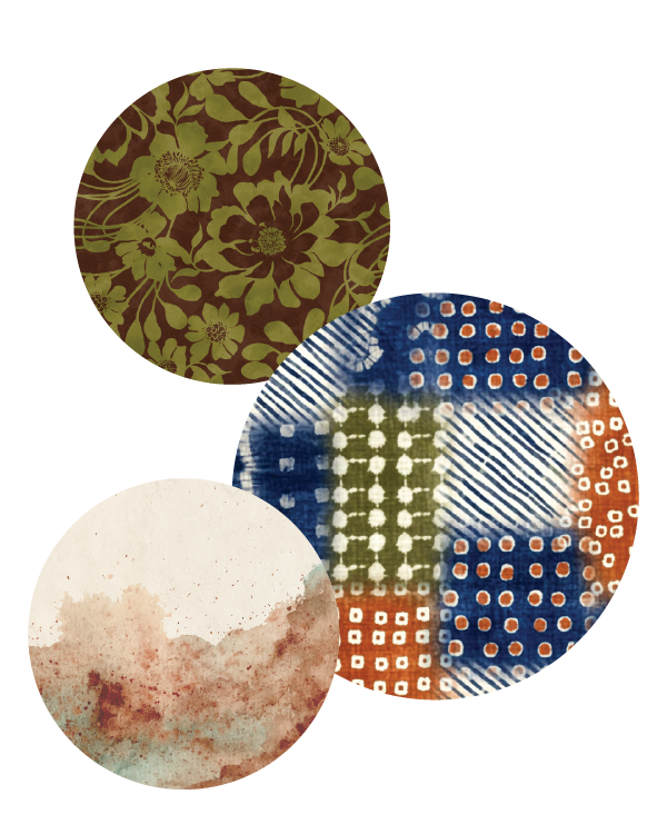
As consumers become fatigued by digital polish, Found + Forged embraces materials and objects that are patched, repaired, weathered, and touched by time. Rust, corrosion, faded surfaces, visible craftsmanship, and other “imperfections” are no longer flaws, they are evidence of authenticity and resiliance. Influences from bohemian design, 1960s folk culture, and natural earth elements soften the industrial character and give this trend a comforting human quality. The result feels free-spirited and expressive, but also grounded in community, craft, and resourcefulness. For packaging, this can translate through raw textures, distressed graphics, hand-drawn elements, worn metallics, and materials that proudly reveal how they were made.
COLOR PALETTE
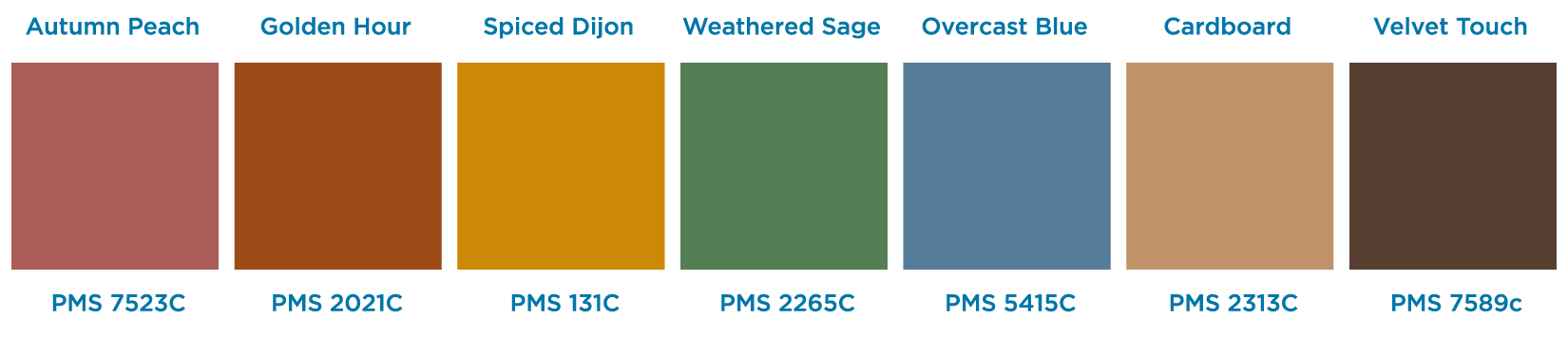
Found + Forged’s core palette is earthy, weathered, and naturally imperfect. Colors take inspiration from materials altered by both human and the passage of time. Key elements include oxidized metals, rust, aged leather, faded textiles, soil, stone, dried botanicals, and well-worn surfaces. Warm earth tones provide a grounded foundation while muted botanical shades introduce the softer, folk influences. Faded and mineral-inspired accents give the palette a collected quality, as though each color has developed character over time. The beauty of the palette comes from its warmth, variation, and imperfection.
COMMON THEMES
VISUAL MOVEMENT
BOLD USE OF COLOR
SURPRISING TEXTURES
Fall/Winter 2027 challenges the ordinary through the escape of modern perfection. Gilded Reverie escapes through fantasy, romance, and excess, while Found + Forged escapes through authenticity, nature, craft, and imperfection. One celebrates the extraordinary. The other celebrates the imperfect. Both make packaging feel human again.
Click to Download our Trend Presentation for More of our Designs!
We Hope You Enjoyed Our Fall Winter 2027 Trend Program!
For assistance with all your packaging needs, please contact us today at 401-943-5040, email info@aandhworldwide.com, or simply click on the button below!