
2026 Packaging Trends
A Year Defined by Color, Emotion, and Intentional Design
As brands look ahead to 2026, one thing is clear: packaging is no longer just about protection or presentation—it’s about emotion, storytelling, and connection. At A&H Manufacturing Worldwide, our 2026 trend reports were developed to help brands understand not just what packaging will look like next year, but why it matters and how to bring it to life in a meaningful way.
Together, these trends form a cohesive story across the full year—moving from lighthearted joy and natural ease to grounded luxury and bold self-expression—while color acts as the common thread tying it all together.
Spring / Summer 2026: Joyful Nostalgia Meets Natural Simplicity
Spring and Summer 2026 are driven by a collective desire to slow down, reconnect, and find happiness in everyday moments. Consumers are gravitating toward designs that feel emotionally comforting, familiar, and optimistic packaging that sparks nostalgia or reflects a deeper connection to nature.
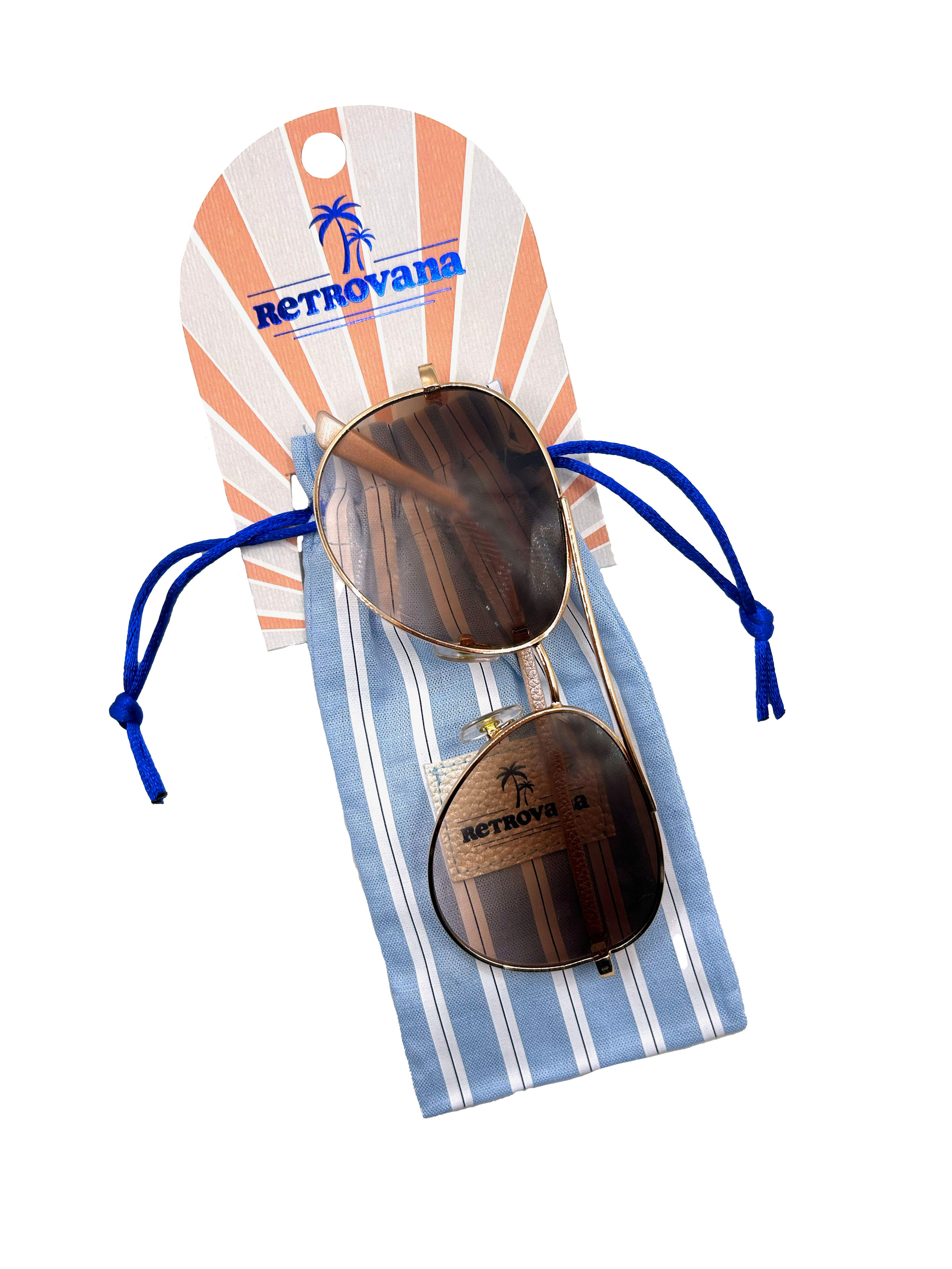
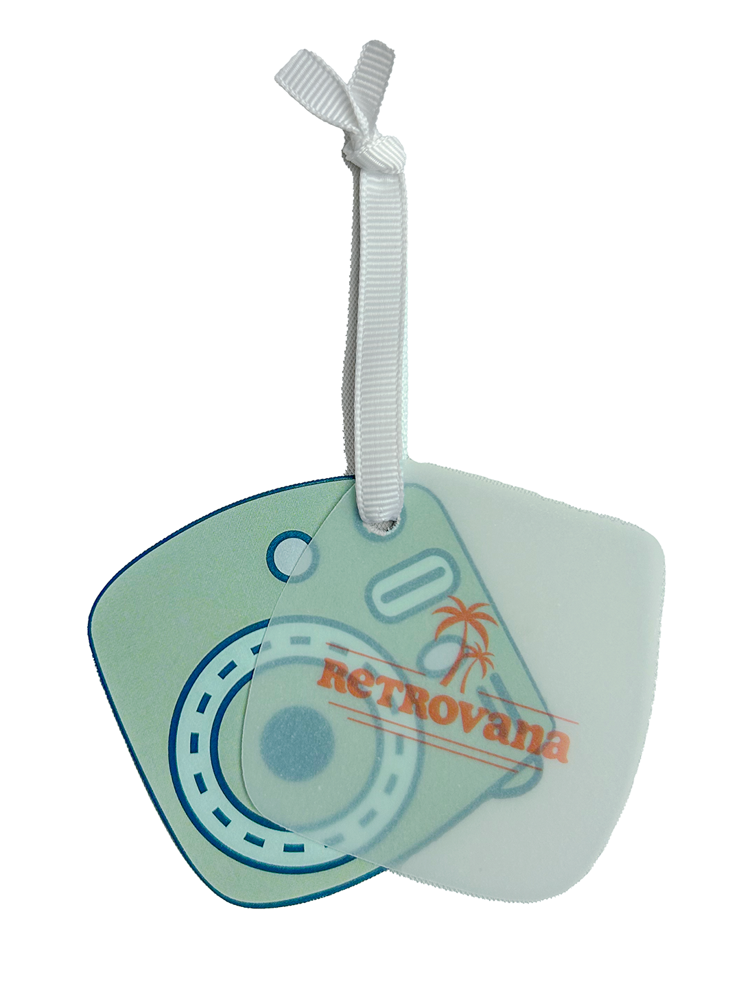
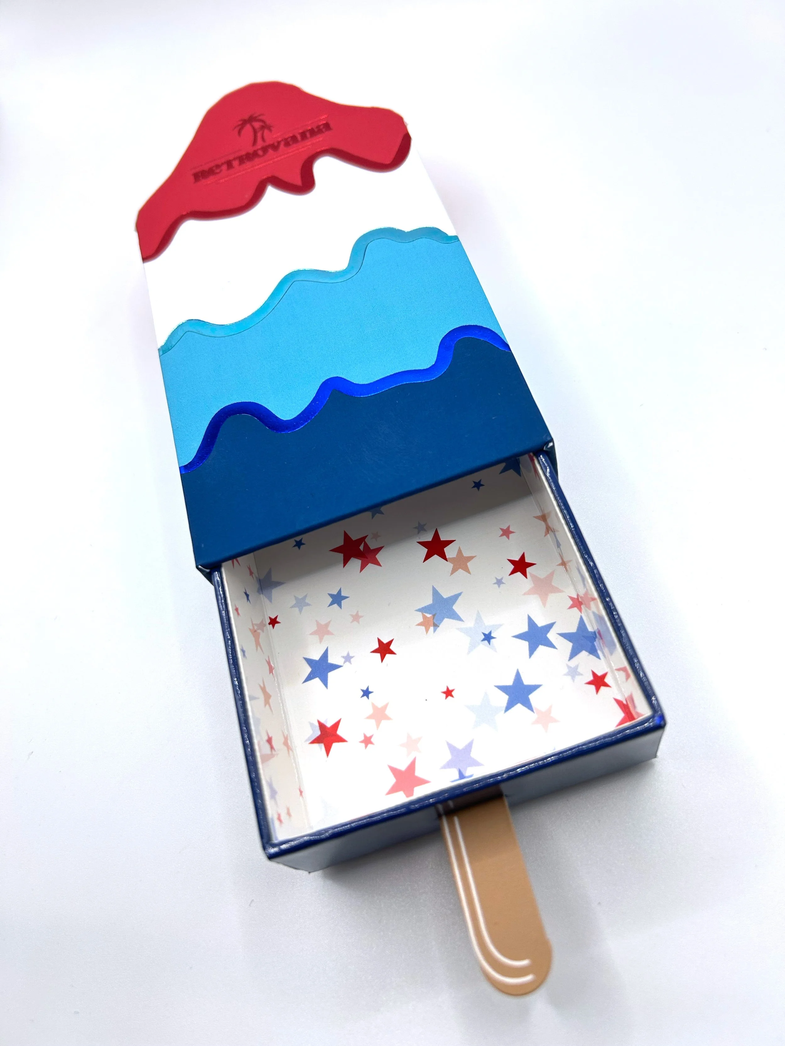
Retrovana captures the playful side of this mindset. Inspired by childhood summers, leisure, and social connection, this trend leans into sporty retro influences and bold, cheerful design. The color palette is vibrant and energizing, anchored by sunny yellows, cherry reds, crisp navy, bright blues, and pops of orange. These colors are often paired with simple, recognizable patterns—stripes, plaids, and color blocking—that feel both nostalgic and modern. The result is packaging that feels instantly approachable, fun, and intriguing.
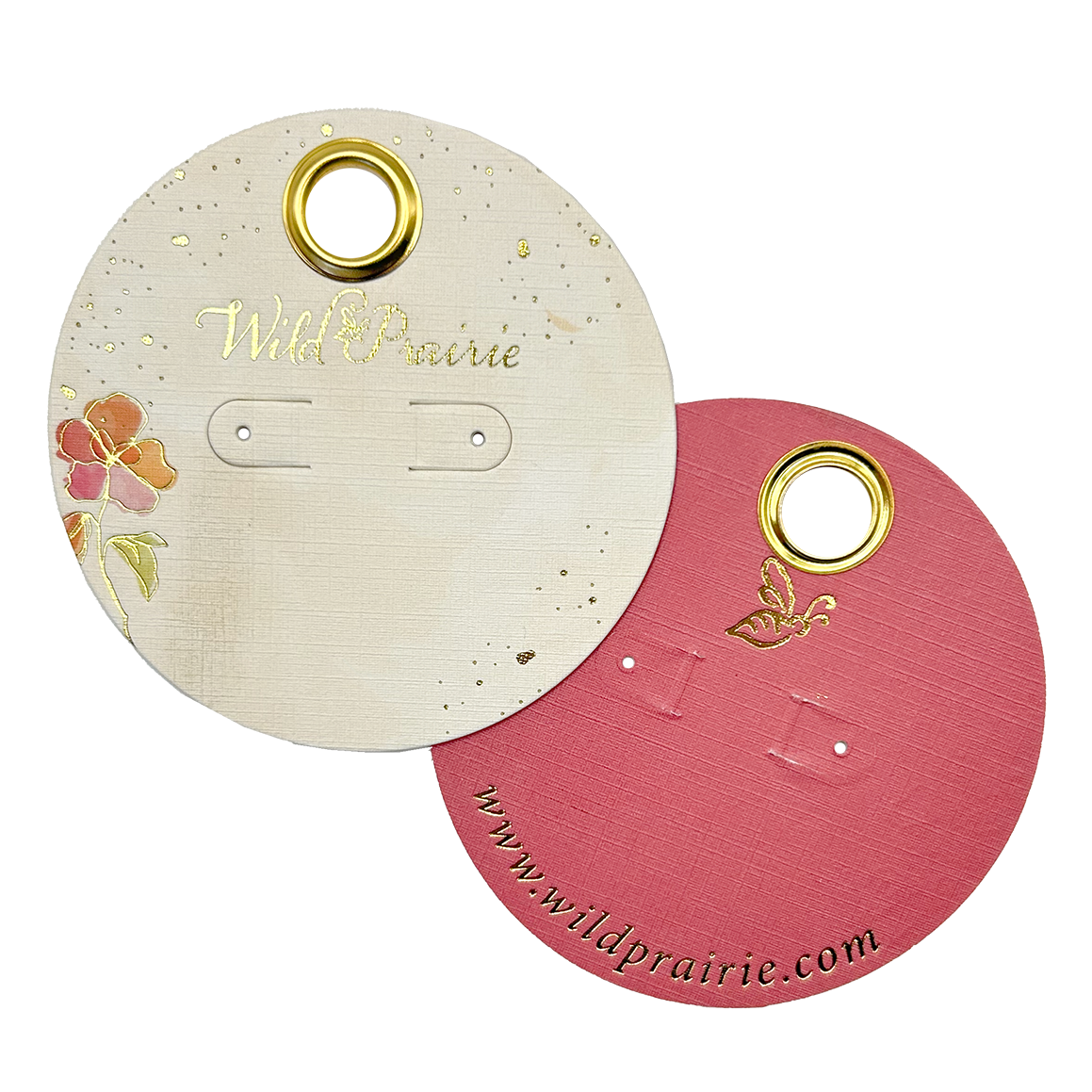
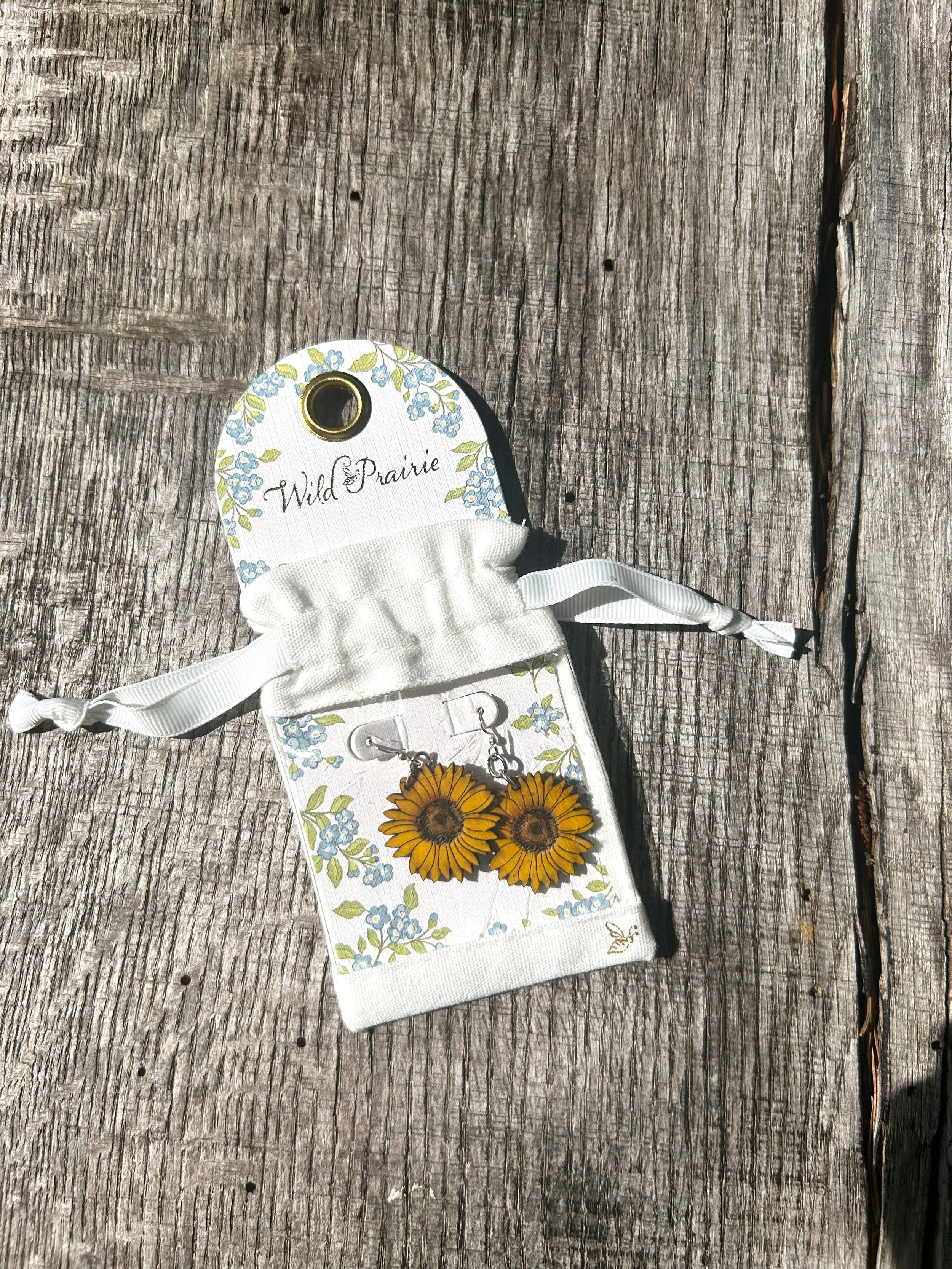
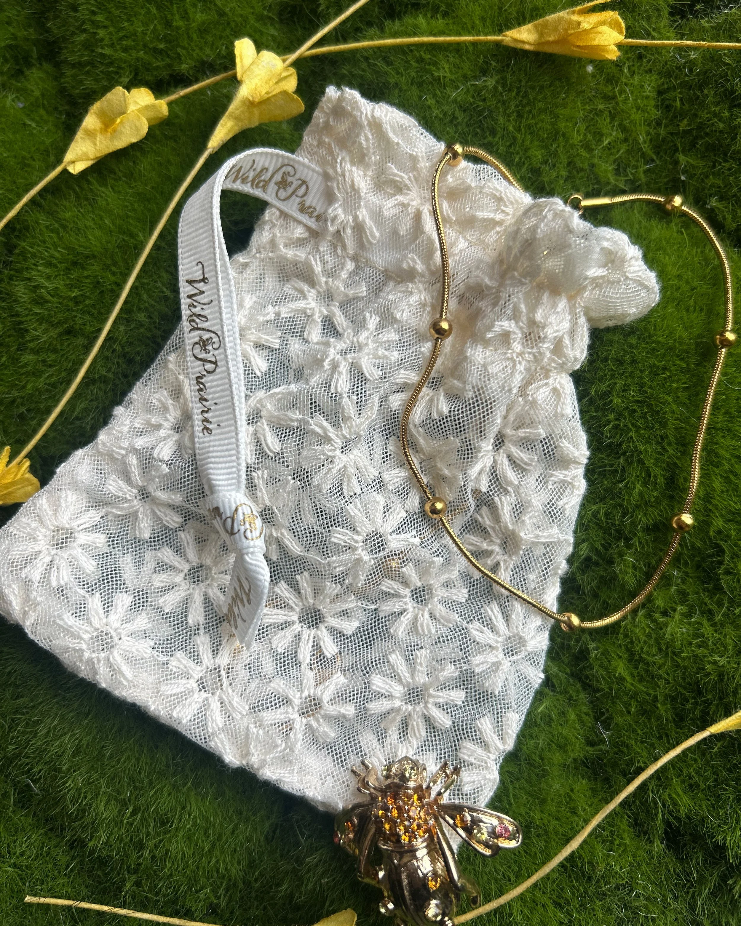
Balancing that energy is Wild Prairie, a softer, more romantic interpretation of the season. Rooted in countryside living and sustainable sensibilities, this trend emphasizes craftsmanship, texture, and authenticity. Colors shift toward nature-inspired tones: dusty blues, algae greens, warm neutrals, and softened florals, accented with subtle pops of red and pink. These hues are often layered through watercolor effects, hand-painted motifs, and tactile materials, creating packaging that feels personal, heirloom-inspired, and emotionally grounded.
Together, the Spring/Summer trends encourage brands to embrace ease, warmth, and emotional resonance—whether through playful color or organic softness. Using these trends can help your brand resonate deeper with your customers while staying current.
Fall / Winter 2026: Grounded Warmth and Bold Individuality
As the year transitions into Fall and Winter, packaging aesthetics deepen, reflecting a cultural shift toward authenticity, self-expression, and tactile luxury. Consumers are increasingly drawn to brands that feel genuine and real. Most of these brands are unafraid to stand apart and break out of conventional norms.
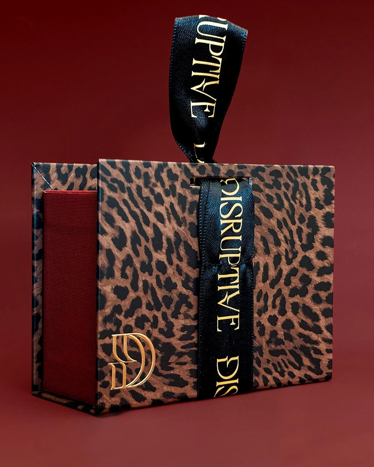
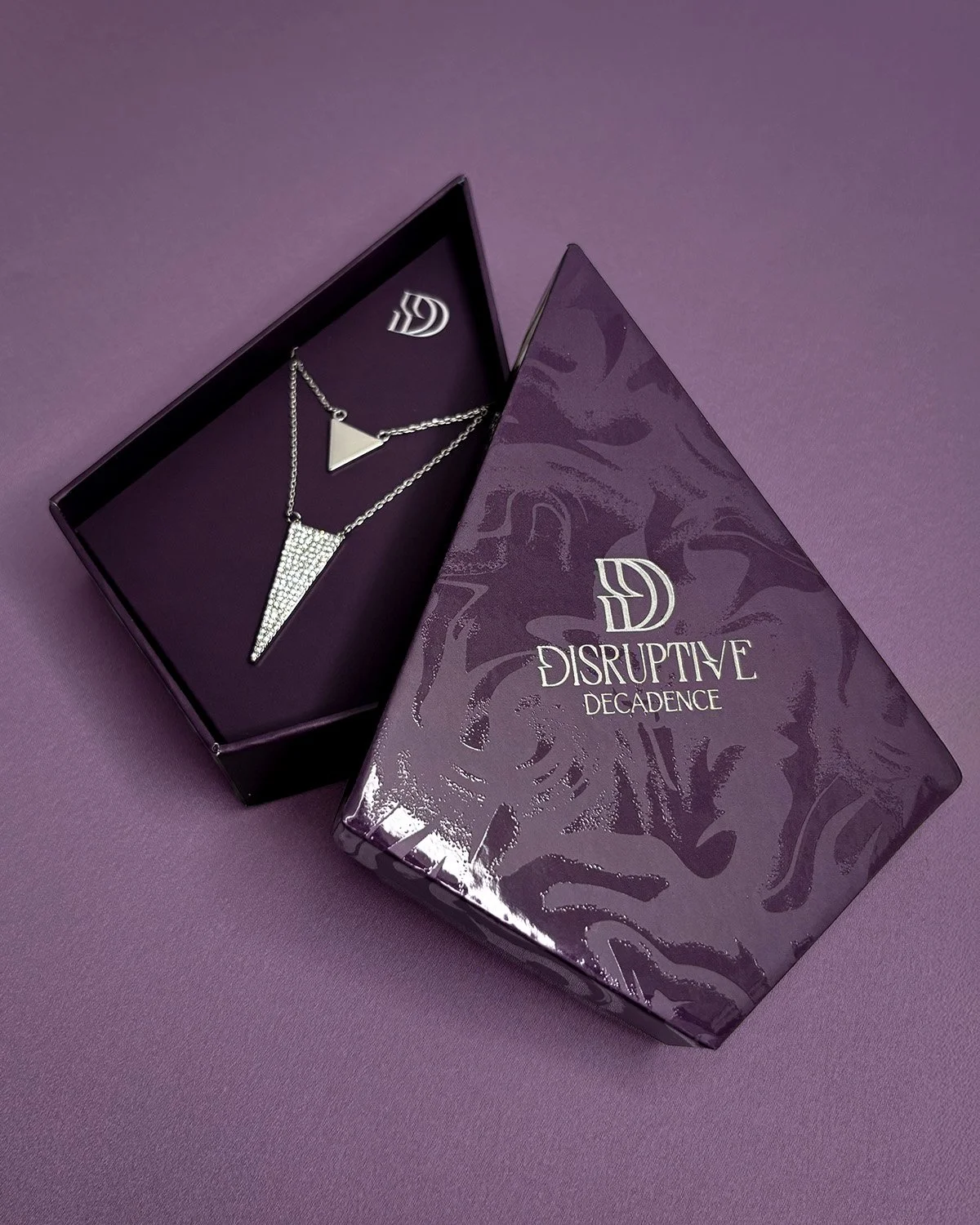
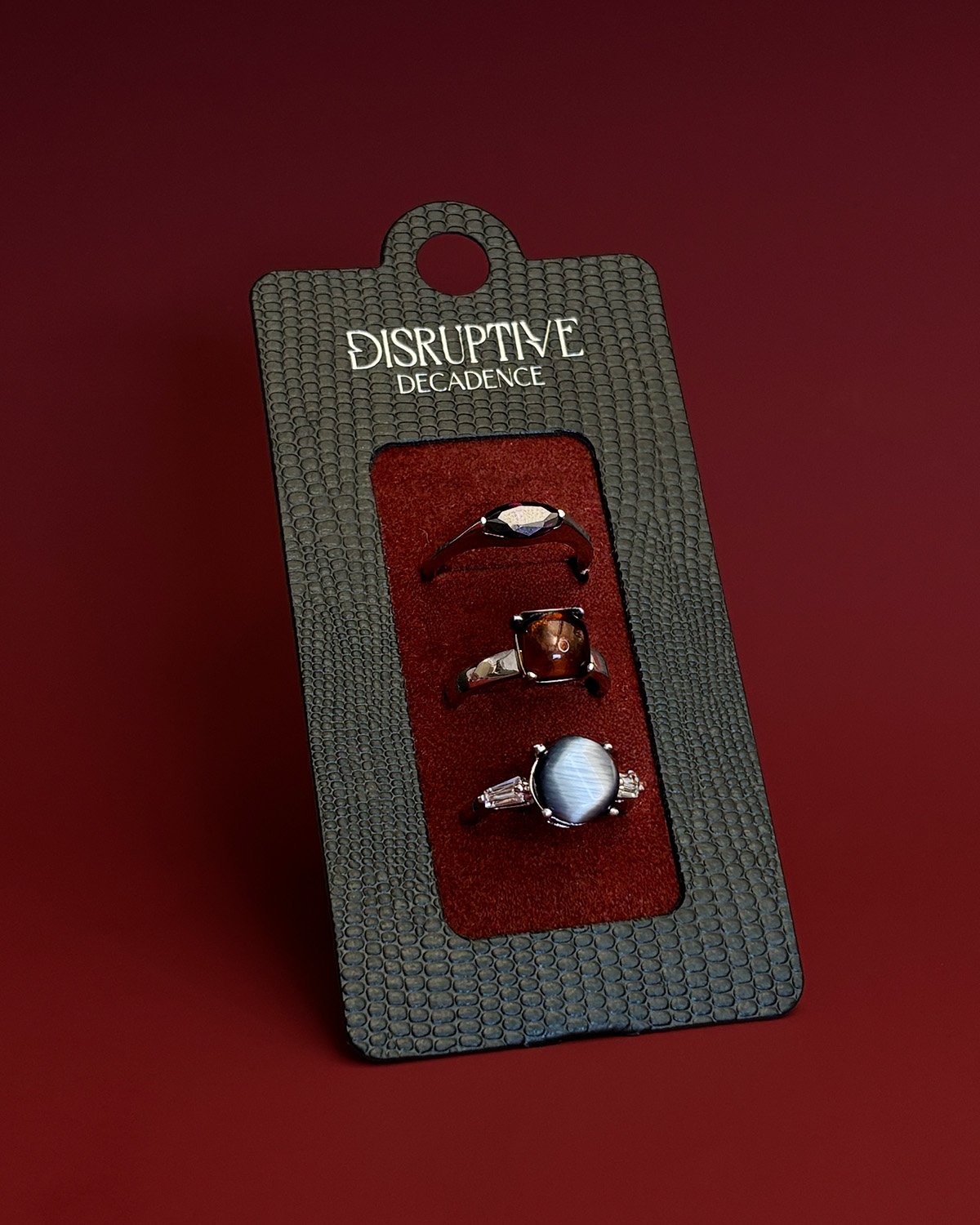
On the other end of the spectrum is Disruptive Decadence, a bold and expressive trend that challenges traditional luxury. This aesthetic thrives on contrast, mixing matte and high gloss finishes, angular shapes with organic patterns, and deep, moody colors with metallic accents. Rich tones like black jam, pomegranate, fig, and smoky neutrals create drama and depth, while texture plays a critical role in elevating the experience. This trend is designed to surprise and engage, turning packaging into a statement piece rather than a backdrop.
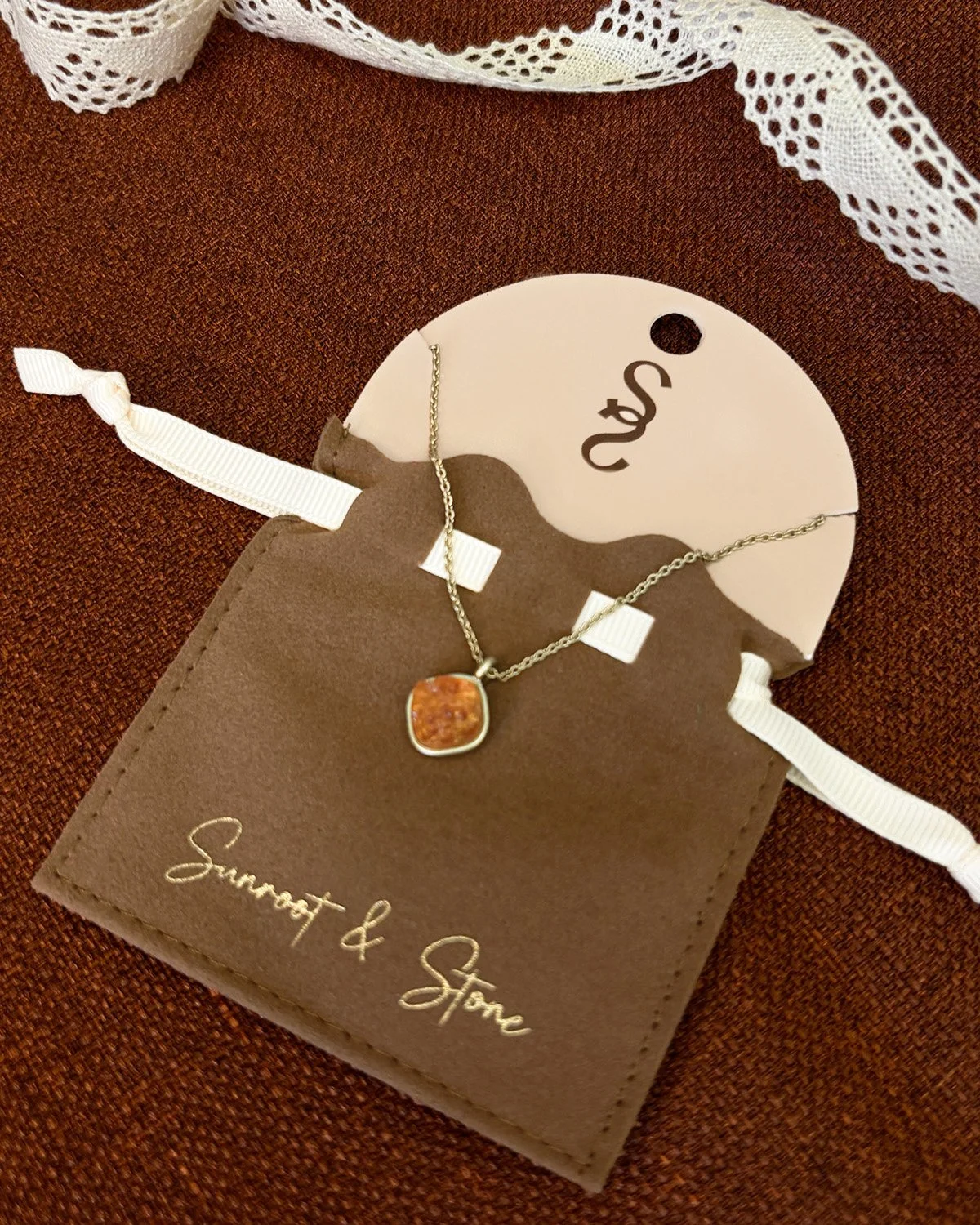
Sunroot & Stone embodies grounded elegance. Inspired by natural materials and bohemian refinement, this trend focuses on sculptural forms, organic line work, and richly textured surfaces. The color story is warm and sunbaked, built on macadamia, soft browns, olive greens, and enduring reds, with lighter blush and lavender tones adding balance. These colors and patterns feel earthy and calming, yet refined—perfect for brands seeking a timeless, elevated look that still feels human and approachable.
Fall/Winter 2026 is about confidence, texture, and sensory impact, inviting brands to experiment while remaining intentional. It pushes the limits on what the consumer is used to seeing to engage consumers on another level.
The 2026 Color Story: One Year, Seamlessly Connected
What makes 2026 especially compelling is how trending colors evolve across the year. Bright, optimistic hues from early seasons gradually soften into earthy neutrals, then deepen into rich, indulgent tones—creating a natural flow rather than abrupt seasonal shifts. This allows brands to build cohesive packaging programs that feel timely year-round while still reflecting seasonal mood changes.
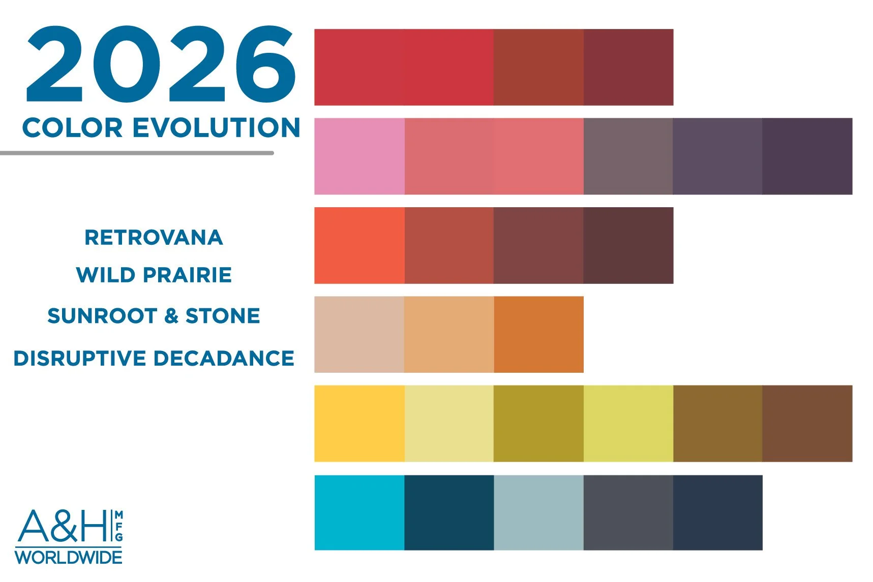
Color in 2026 is never random; it’s used to evoke emotion, reinforce identity, and create meaningful connections with consumers whether through playful contrast, subtle layering, or dramatic depth.
Bringing the 2026 Trends to Life with A&H
At A&H, trends don’t live only in concept, they’re translated into real, functional packaging solutions that fit your product and brand. Our team works closely with brands to interpret the right aesthetic in ways that align with their products, markets, and operational needs.
From boxes, carding, tags, and labels to pouches, displays, and specialty packaging, we help brands apply colors, textures, and design elements across complete packaging systems. Our in-house design and engineering teams collaborate to ensure trend-driven packaging is not only beautiful, but practical and scalable. With global manufacturing capabilities in the USA, China, and Vietnam, we’re able to adapt materials, finishes, and structures to meet budget, volume, and sustainability goals without compromising design intent. Most importantly, we are a partner throughout the process, helping brands decide how much trend to apply, where it makes the most impact, and how to evolve packaging programs over time.
Click to find more inspiration on 2026 trending designs and colors
If you’re ready to incorporate these trends into our brand, contact us today to get started on a project!