

SPRING SUMMER 2027 TREND
VISUAL MOVEMENT
BOLD COLORS
TEXTURE FOCUSED
Unified by the celebration of natural imperfection and a counter cultural push back against rigid societal standards, this season’s trend stories reflect a growing consumer desire for packaging that uplifts, surprises, and meaningfully engages. While each trend offers a distinct visual identity, together they embody a spirit of creative freedom and authenticity. This shift away from uniformity and perfection signals a future where packaging becomes a playground for experimentation, delight, and genuine connection with consumers.
We’ve highlighted key design features throughout this program, including innovative and experimental printing techniques, high-contrast varnishes, and the incorporation of irregular, unexpected shapes and textures to battle consumer burnout and encourage joyful expression.
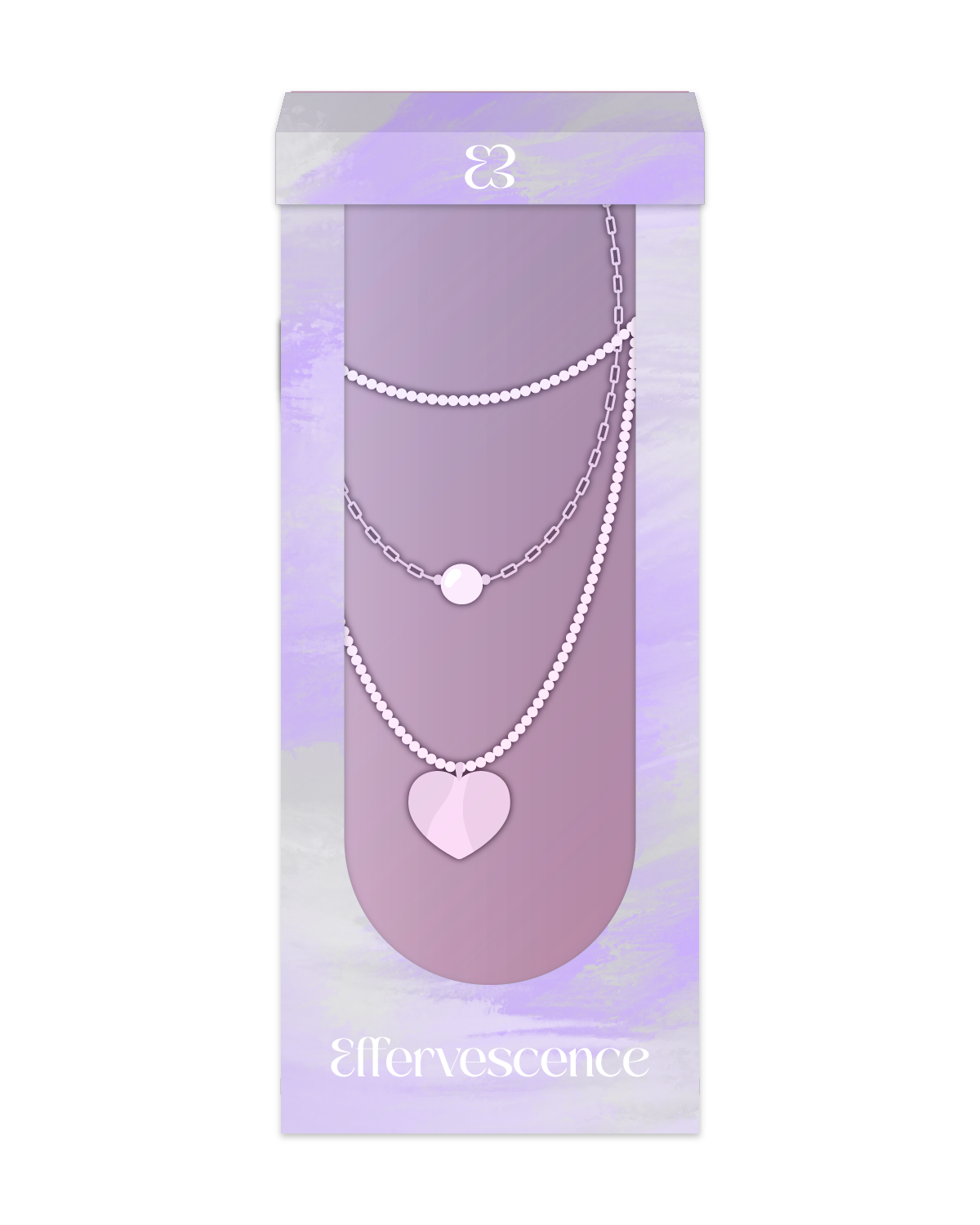
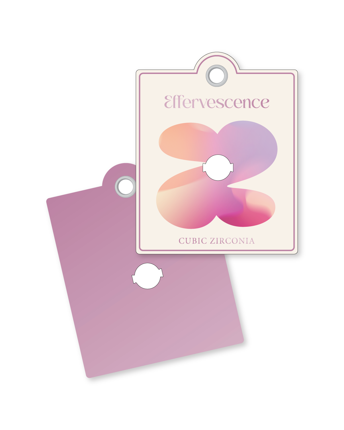
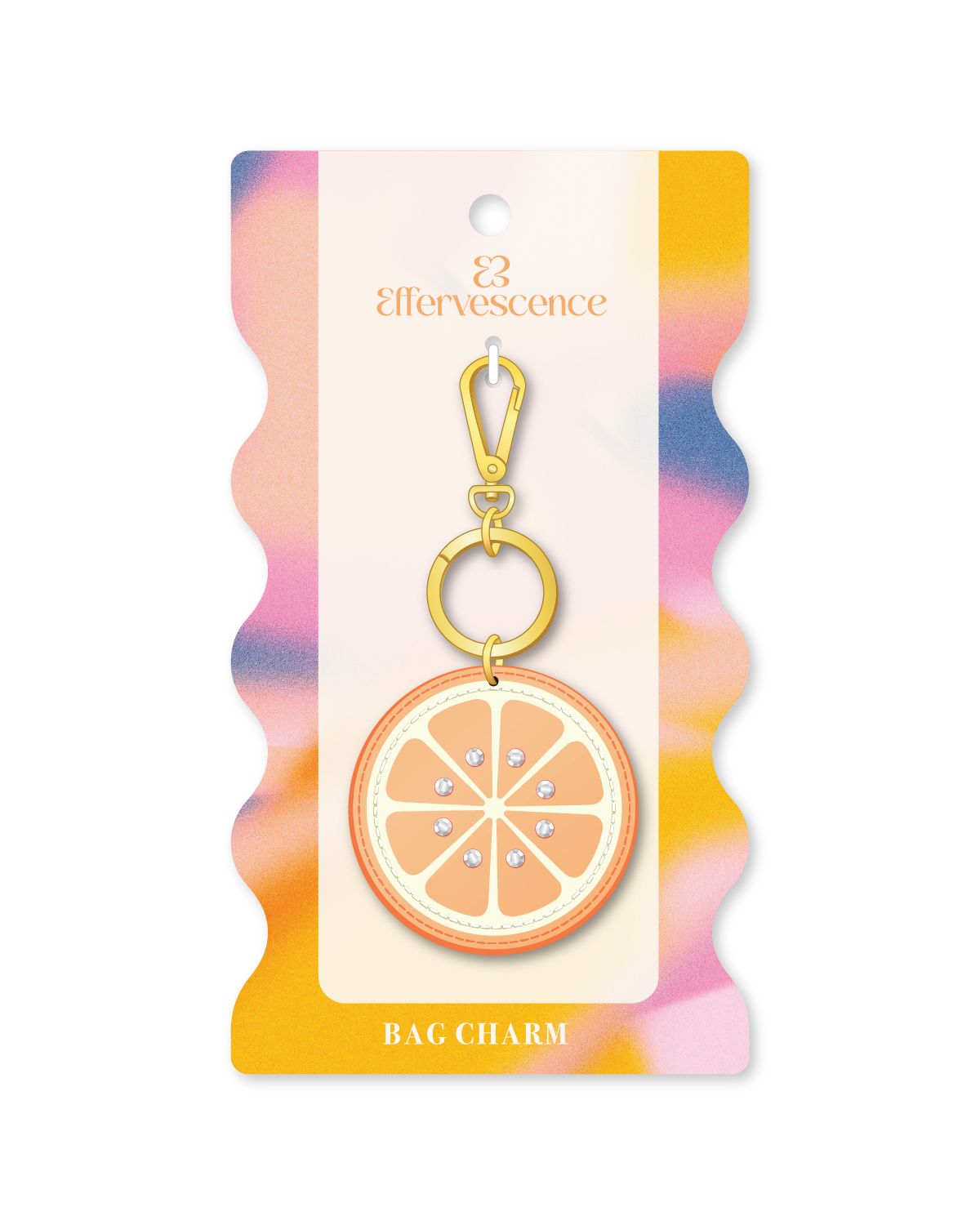
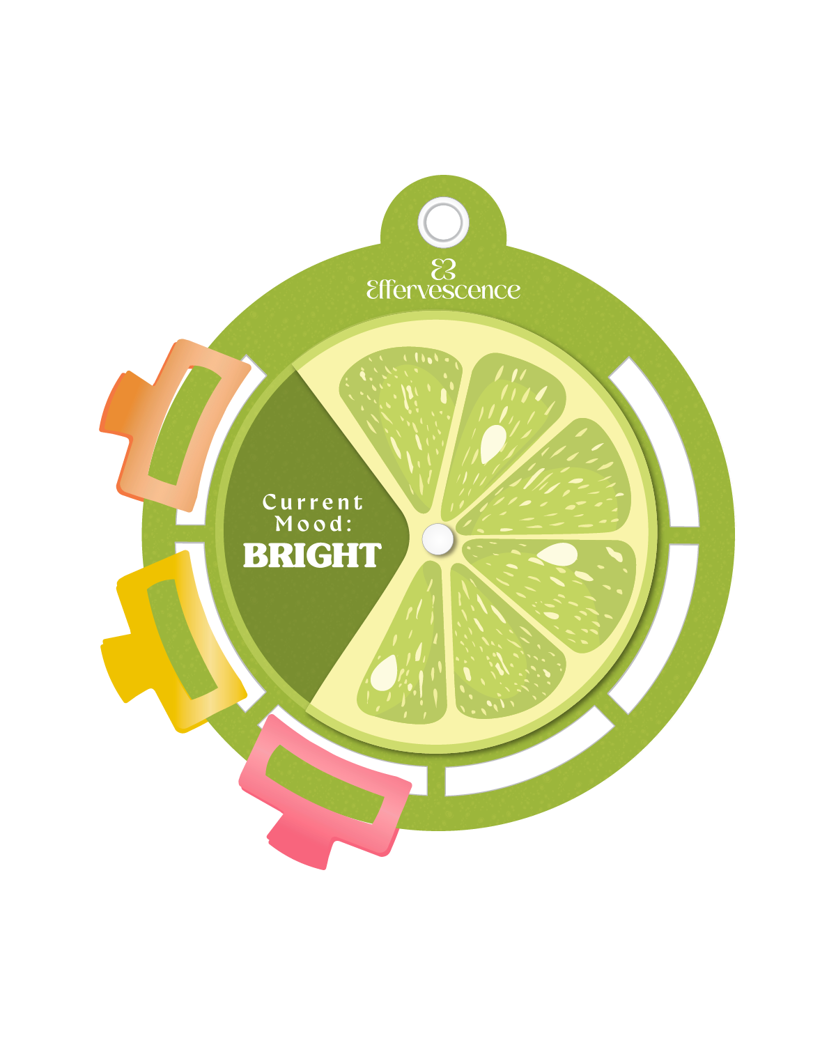
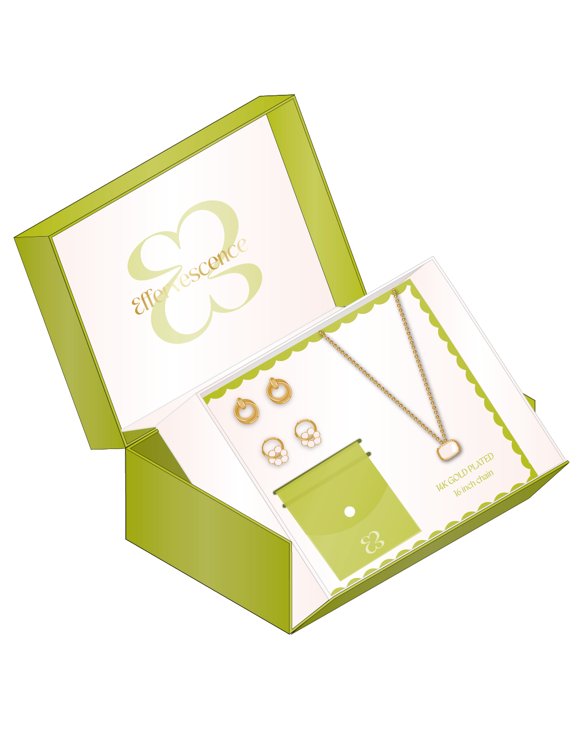
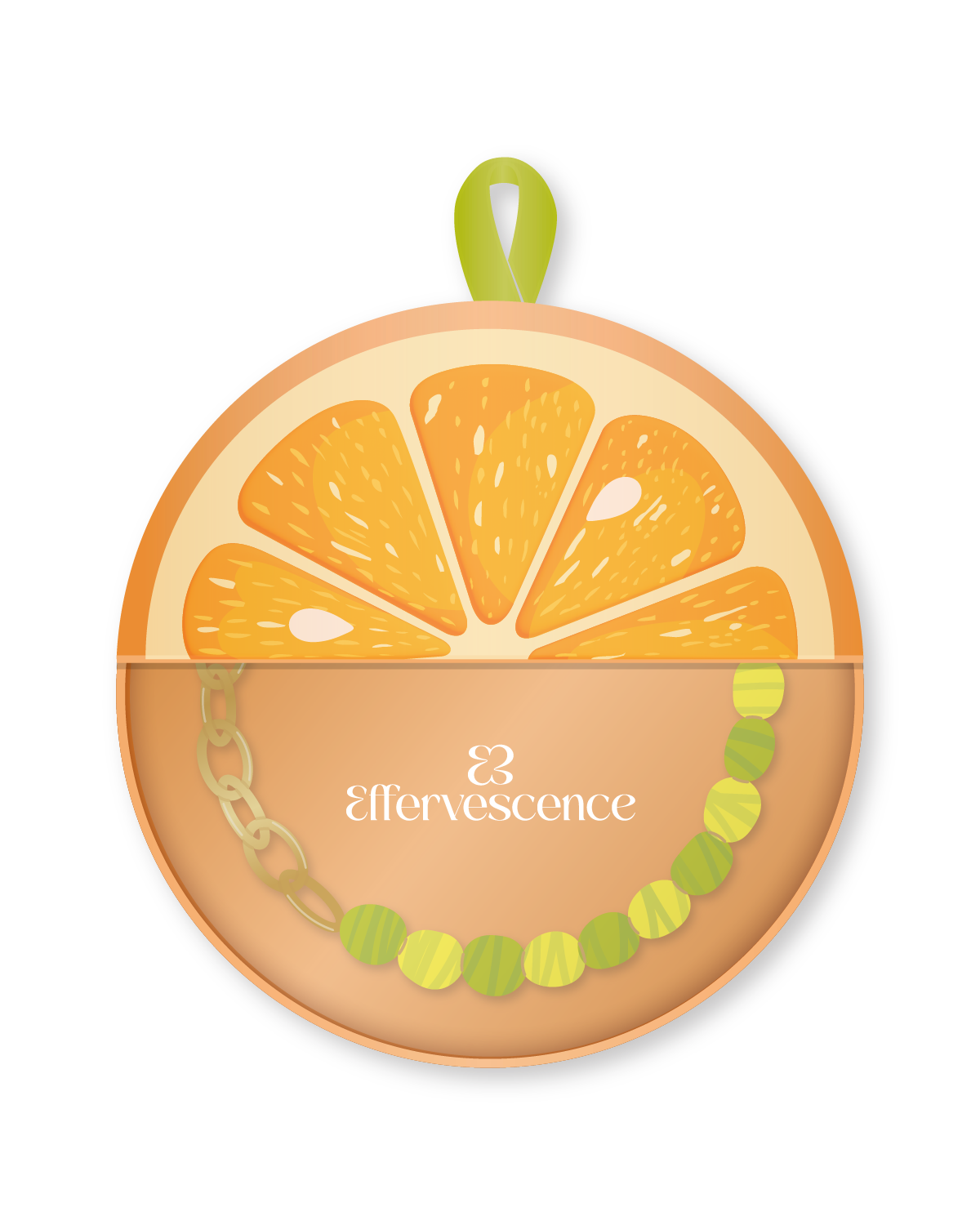
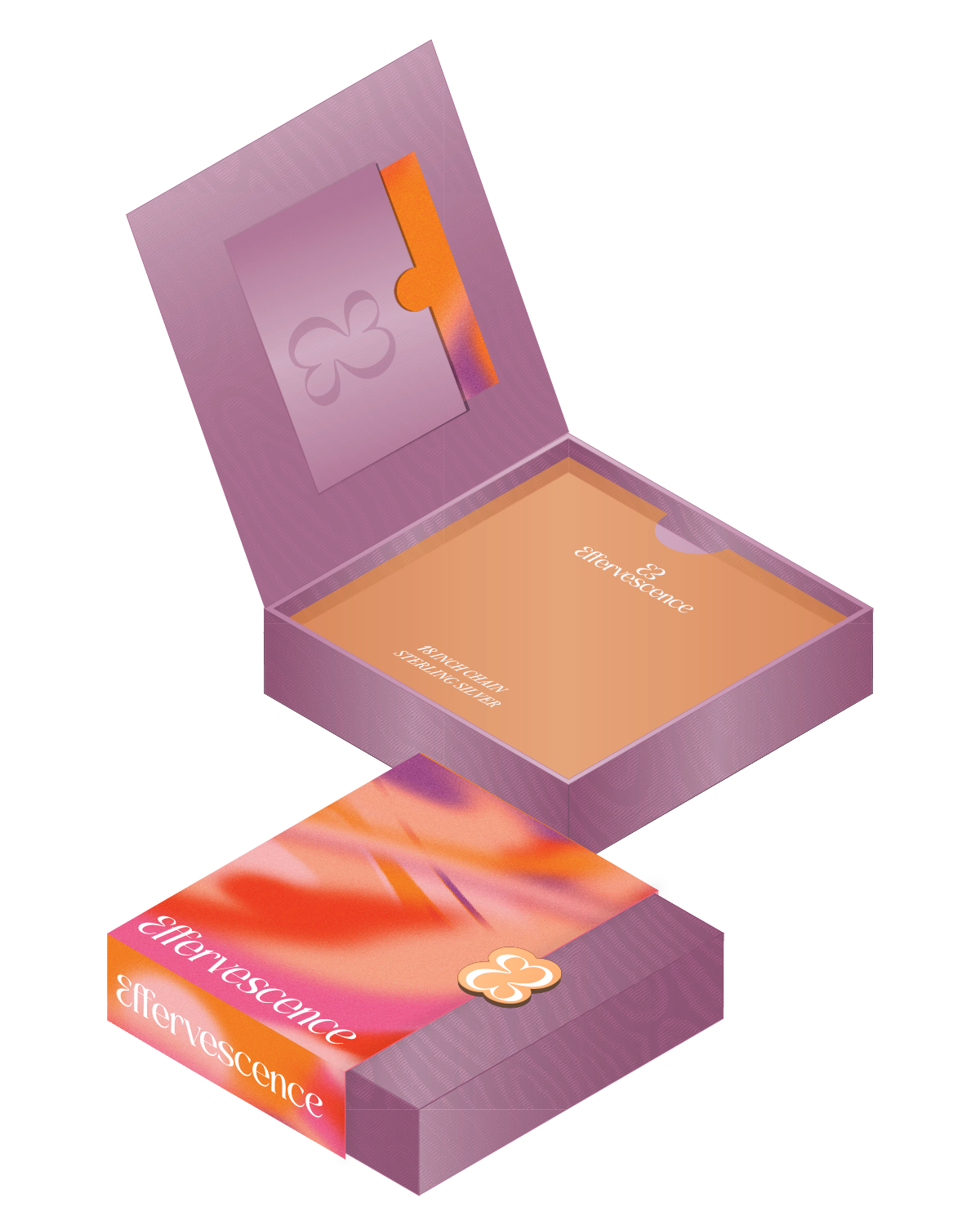
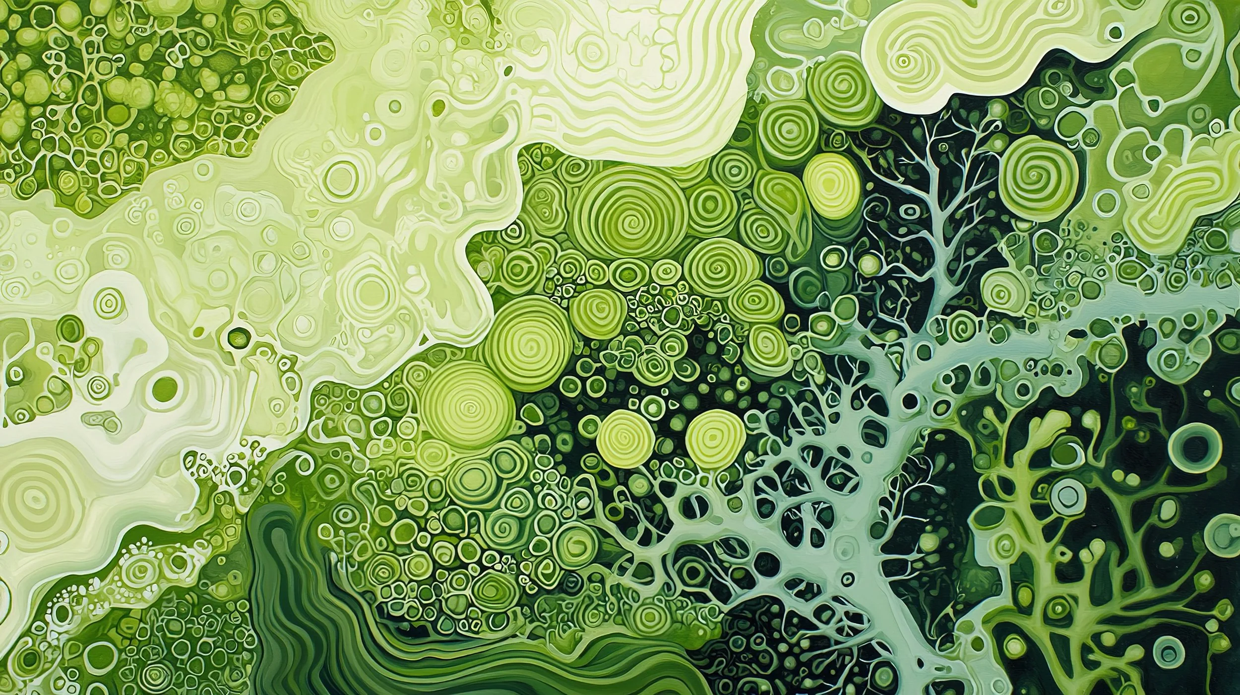
EFFERVESCENCE
SPONTANEOUS
OFFBEAT
DELIGHTFUL
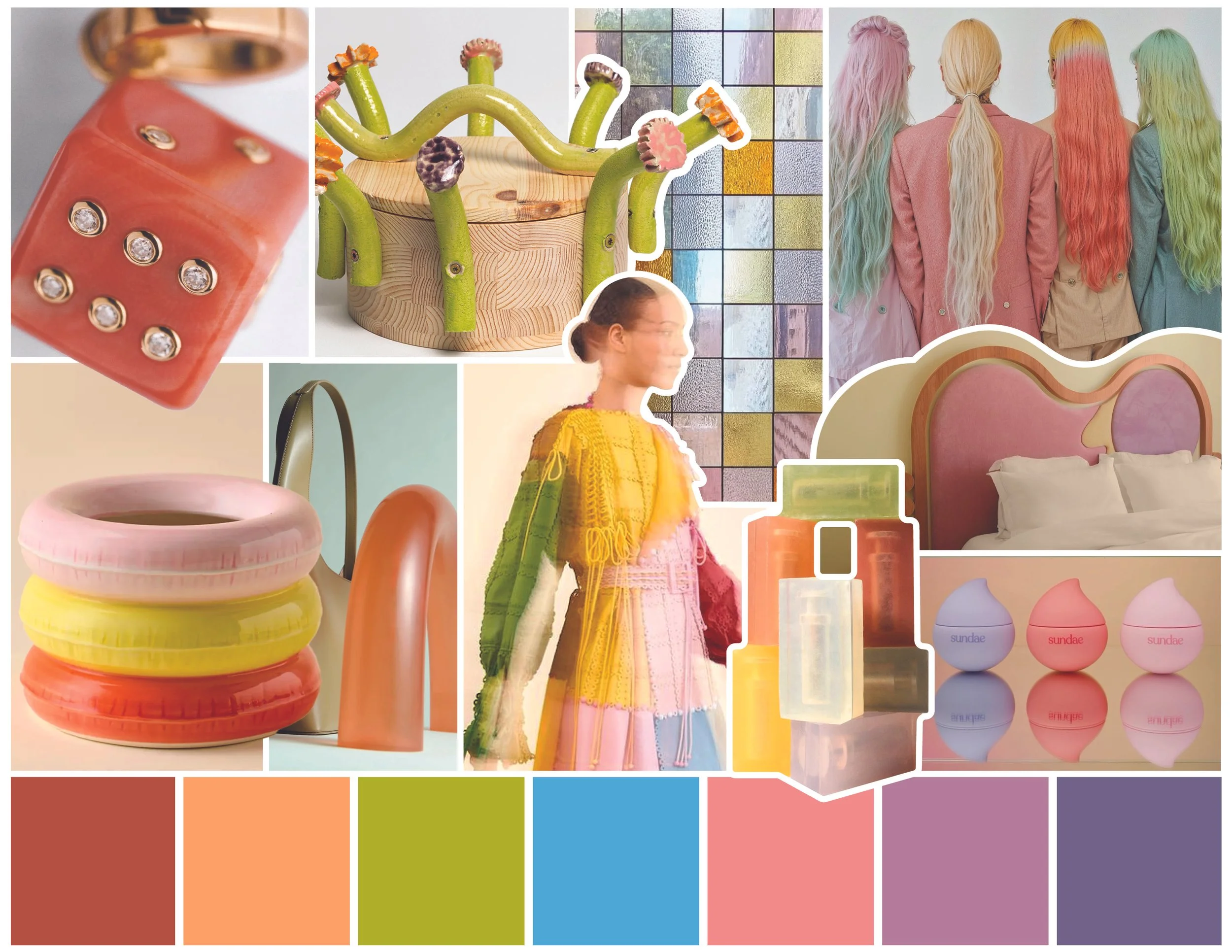
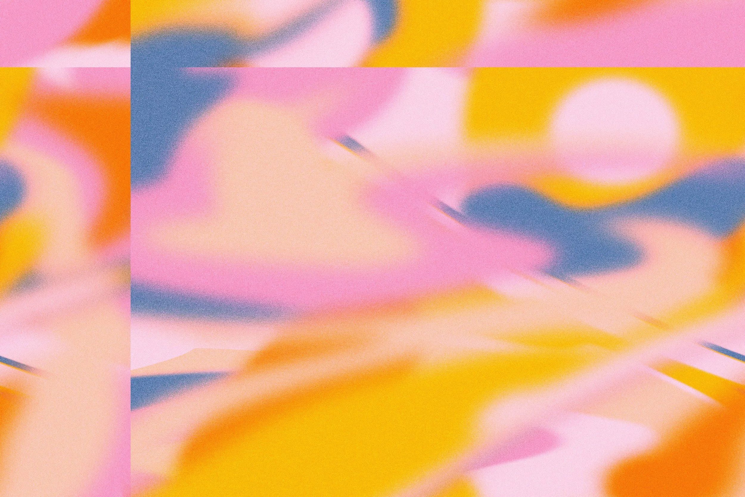
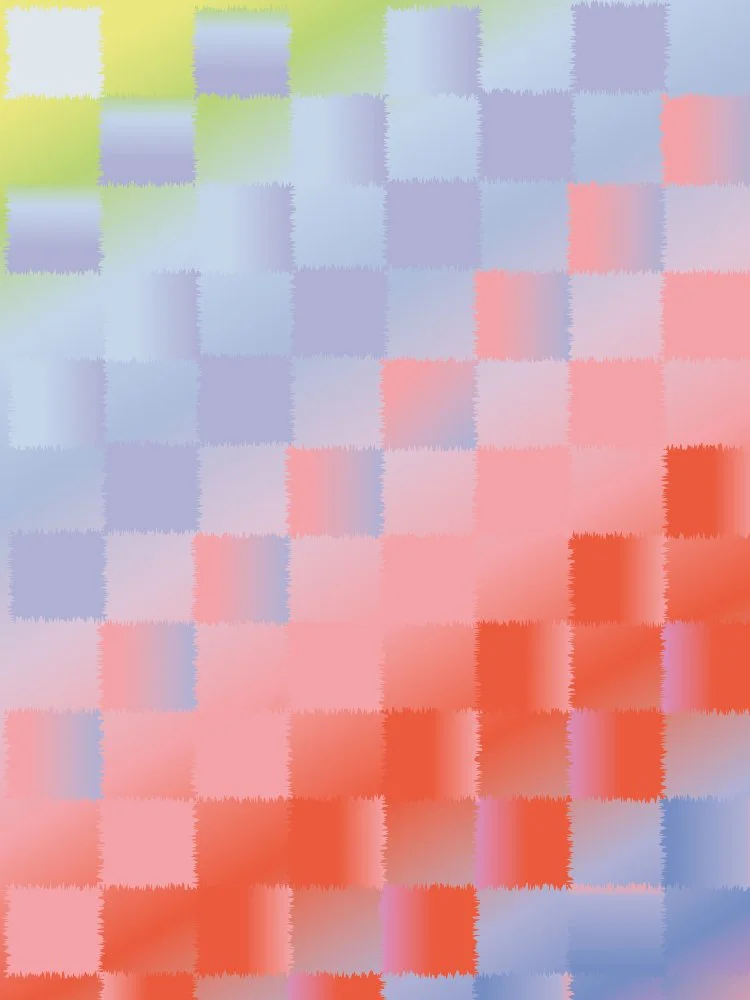
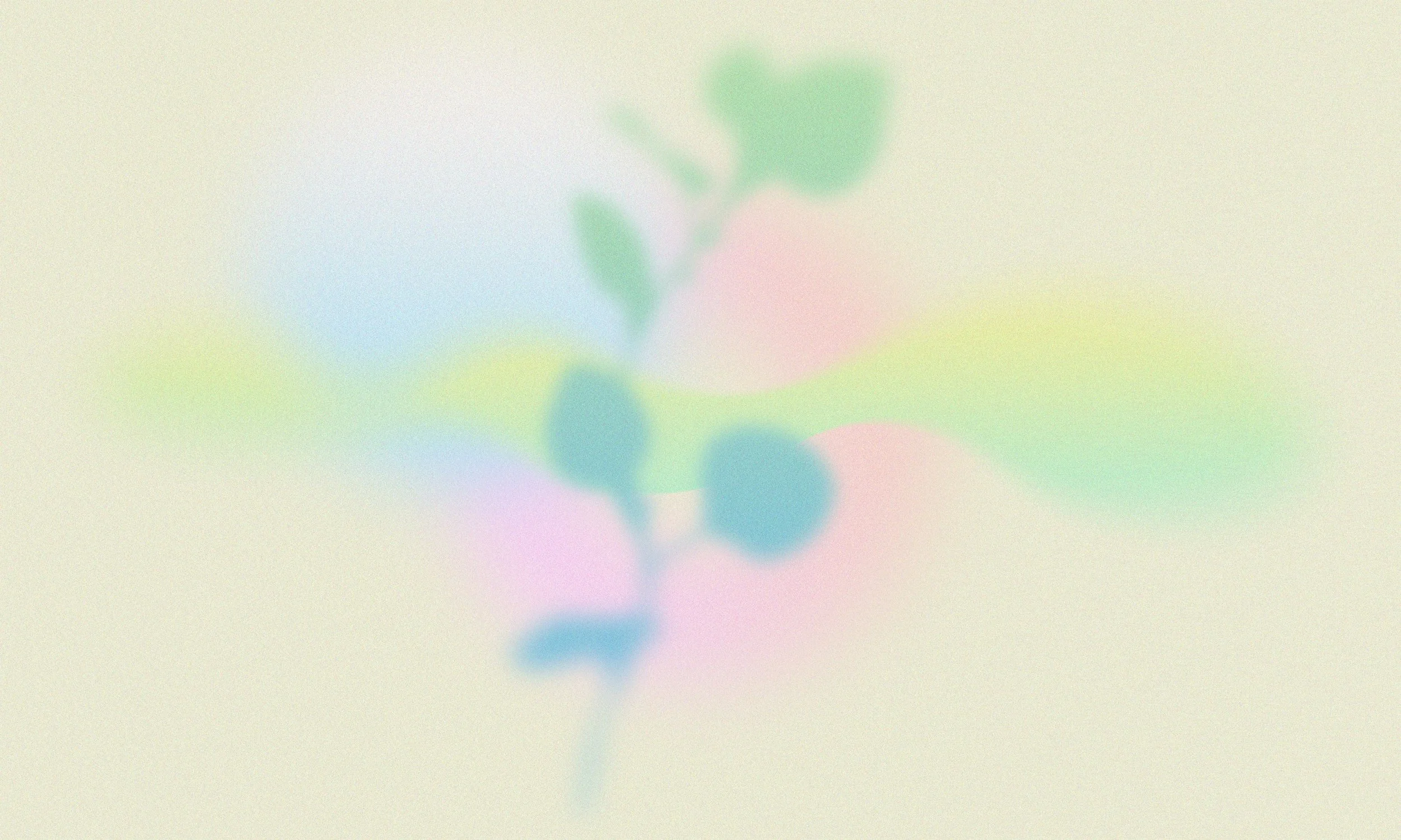
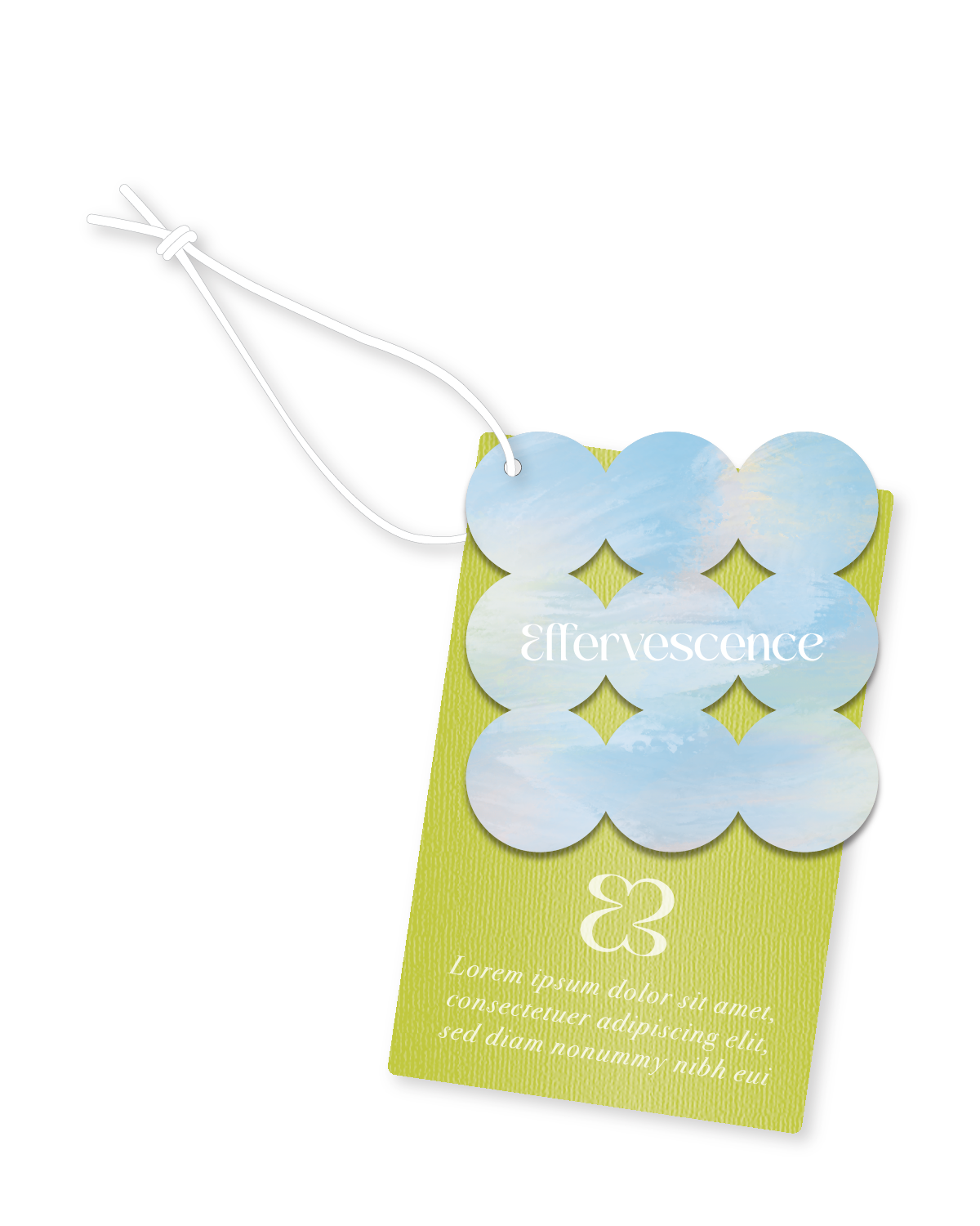
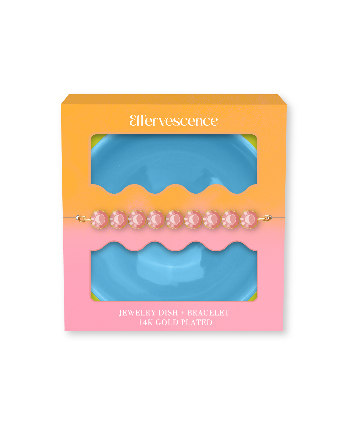
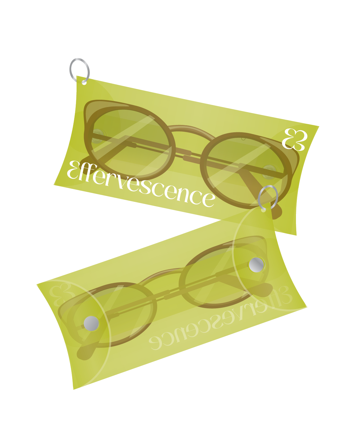
Effervescence flips the script on conventional design by embracing curated chaos and intentional oddity. Playfully imperfect by nature, this trend boldly challenges the rigid aesthetic standards of conventional “good taste,” inviting brands and consumers alike to find beauty in the unexpected. Abstract patterns like hazy gradients and florals and sculptural shapes create an illusion of movement that draws the eye, while bubbly embosses and jelly like substrates offer a dreamlike tactile experience.
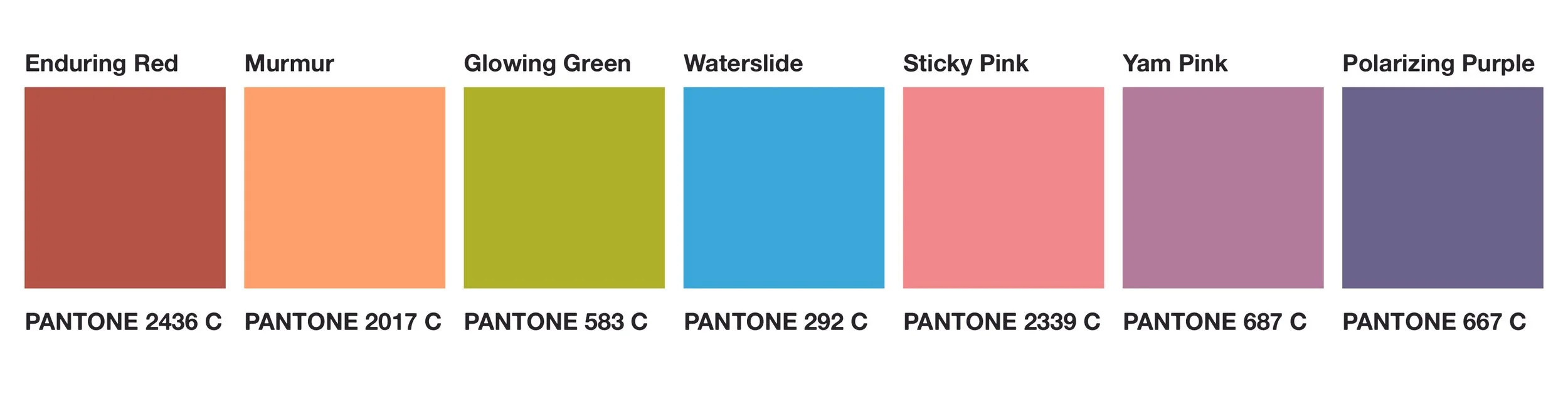
COLOR PALETTE
Effervescence color palette taps into a world between a dreamscape and dopamine rush. Sweetly subdued hues like Sticky Pink and Murmur create a soft foundation, while Glowing Green and Waterslide bring an unexpected bite of brights. This playful yet intentional palette is equally suited for airy ombrés as it is bold clashing combos. Consider using these pops of color in spot foiling, translucent substrates, an unconventional printing techniques.


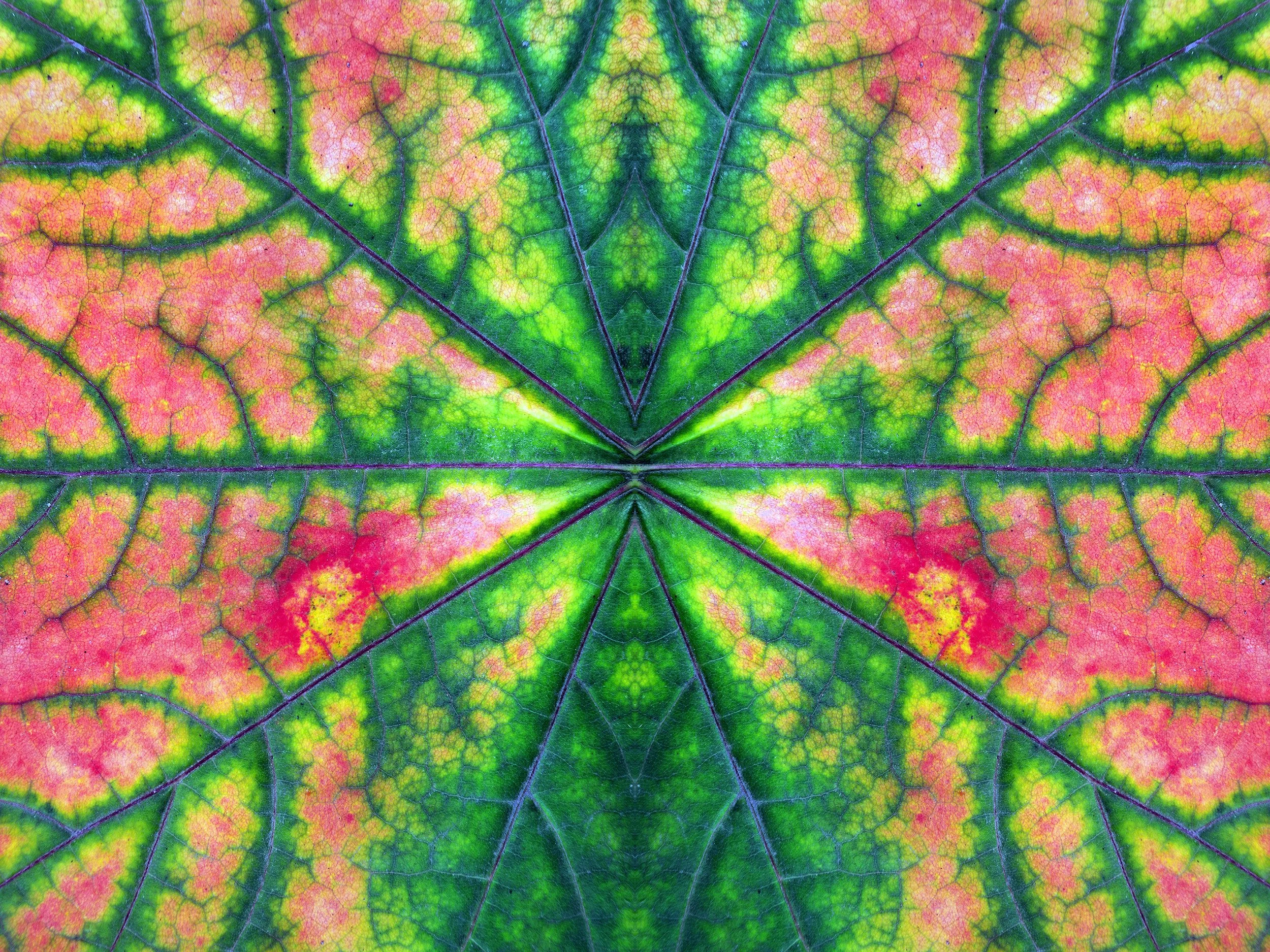
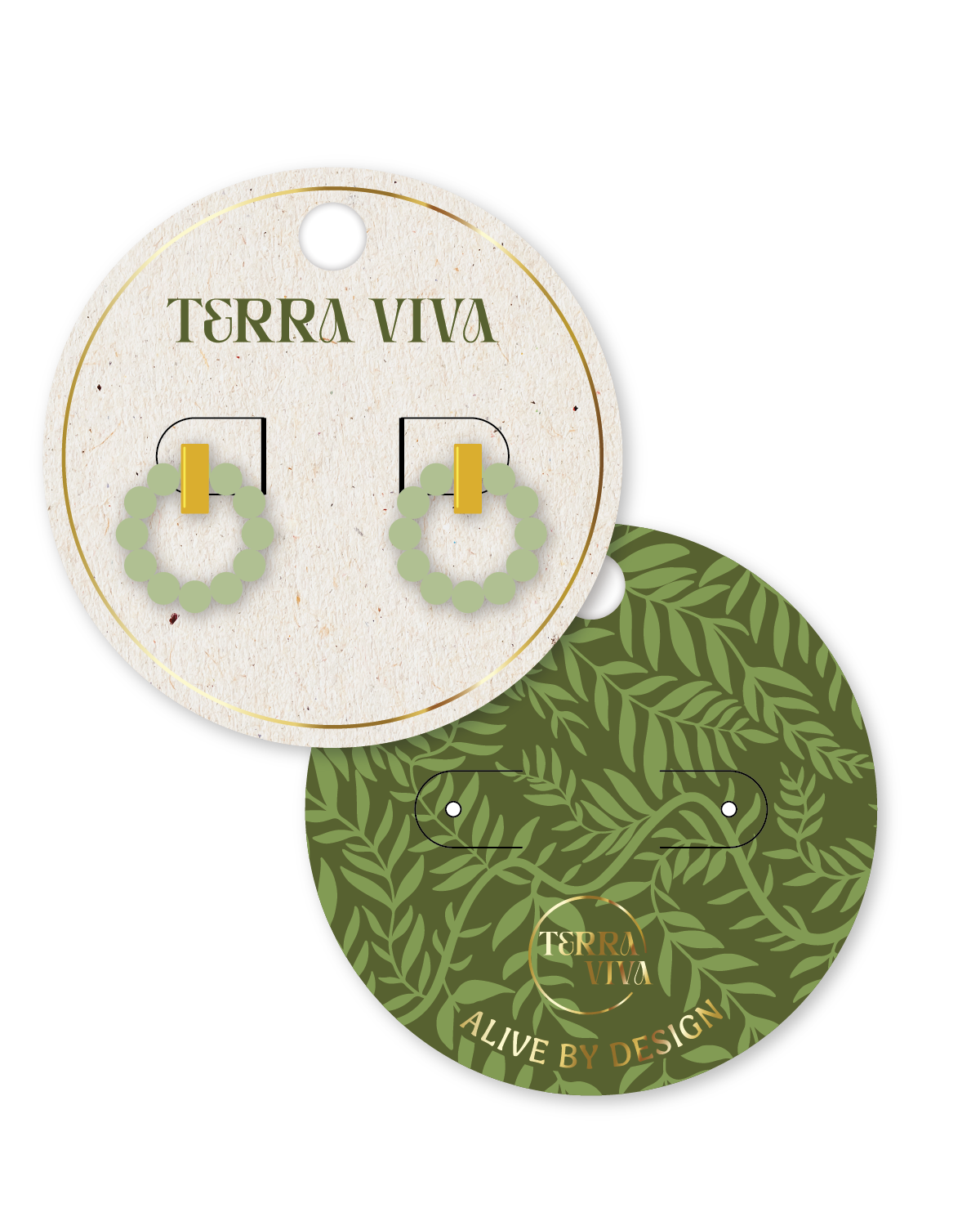
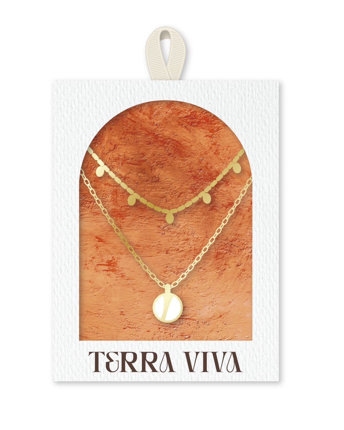
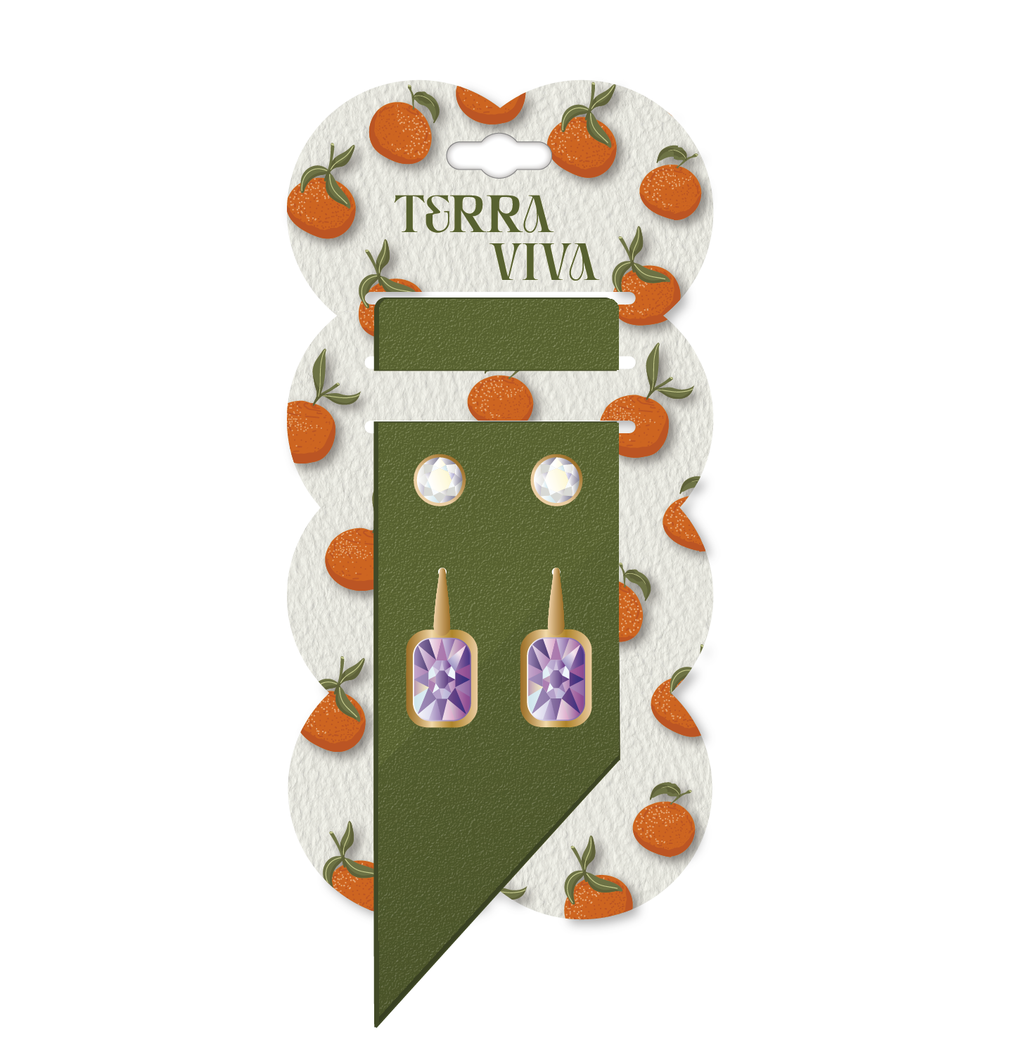
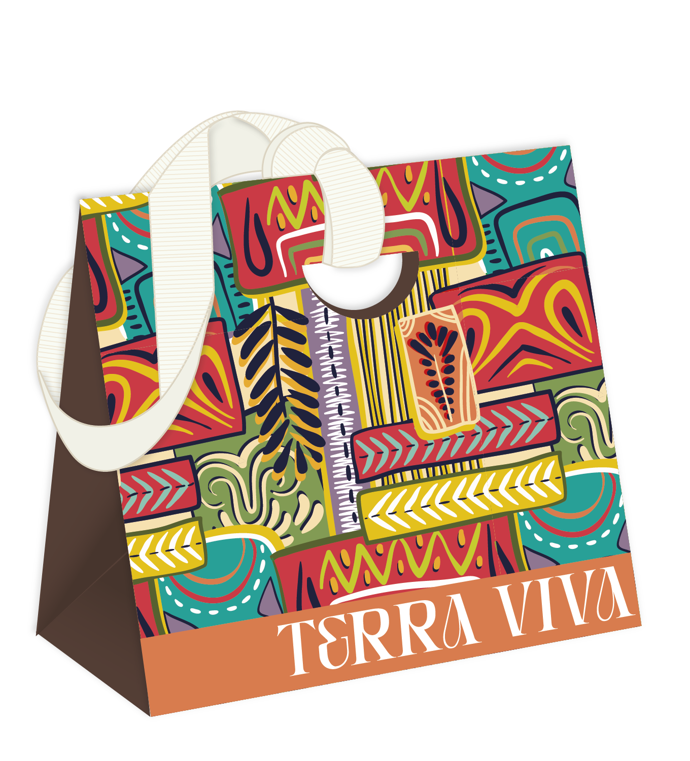
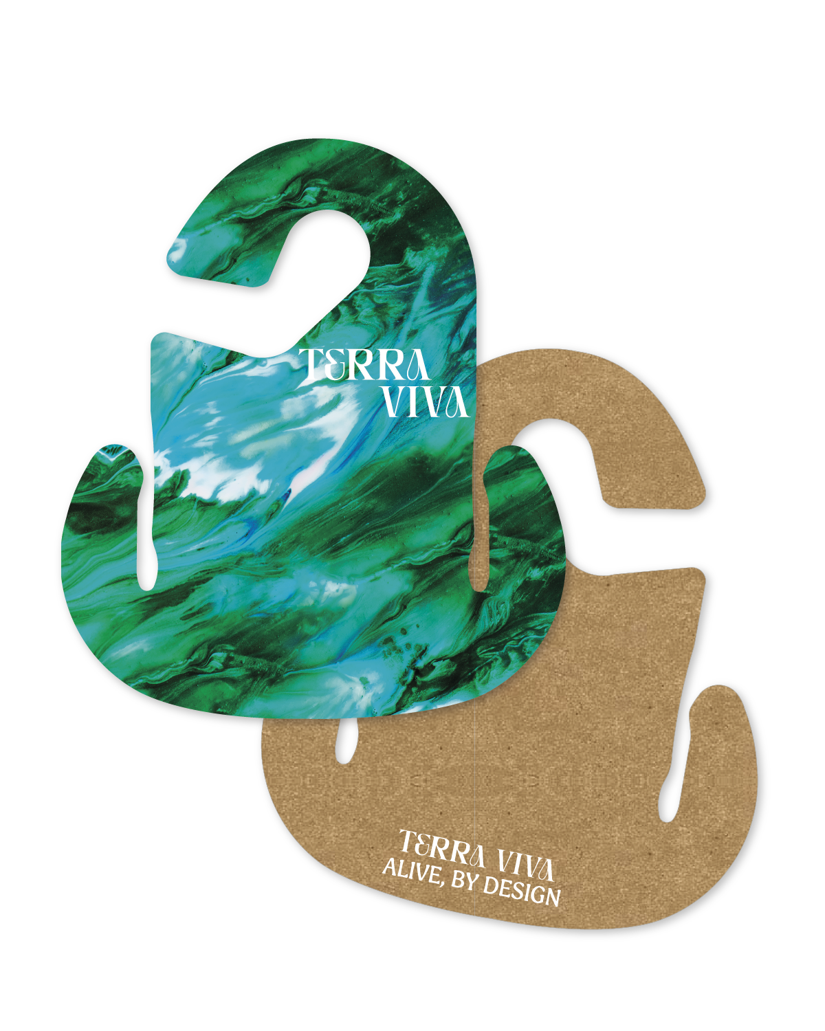
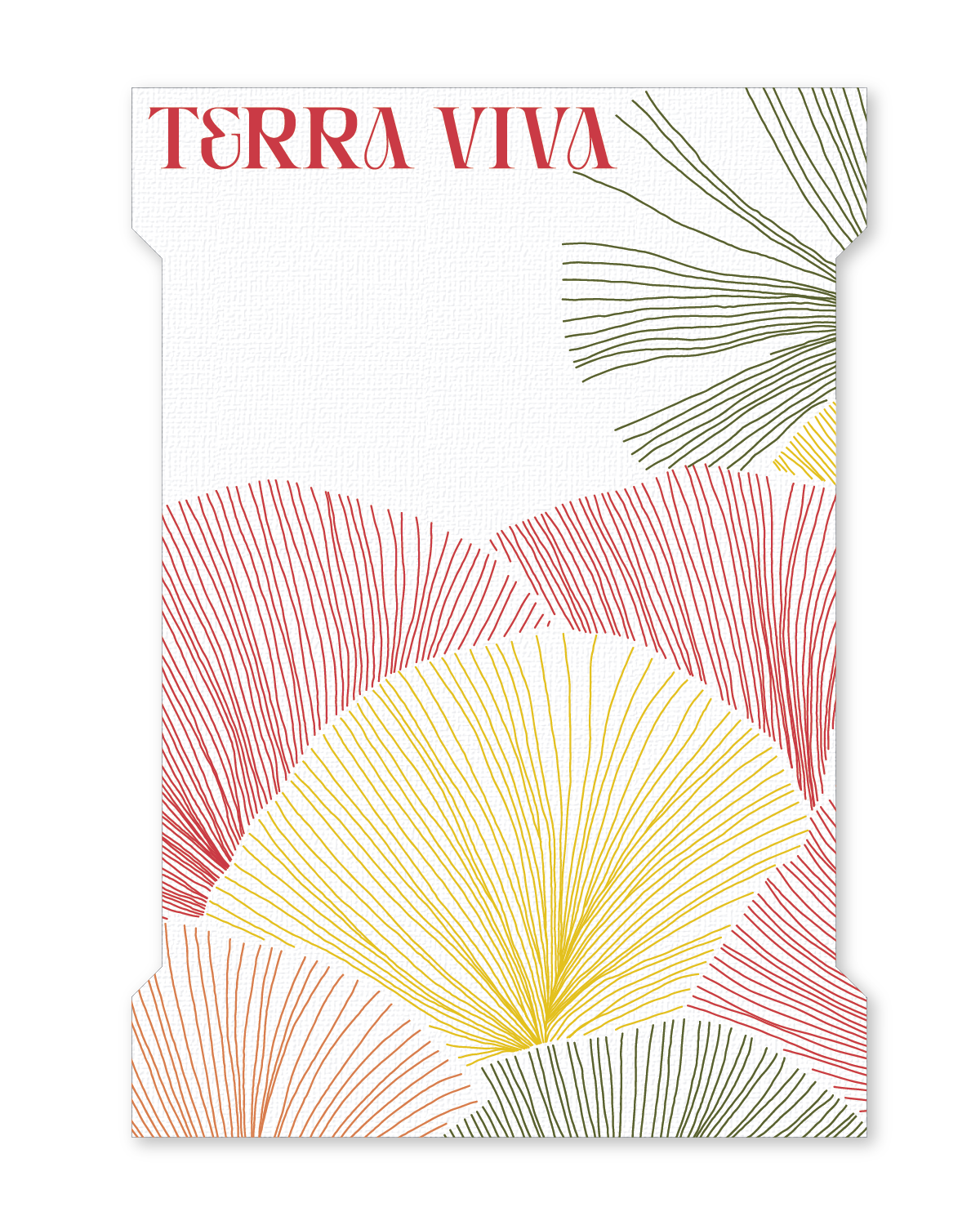
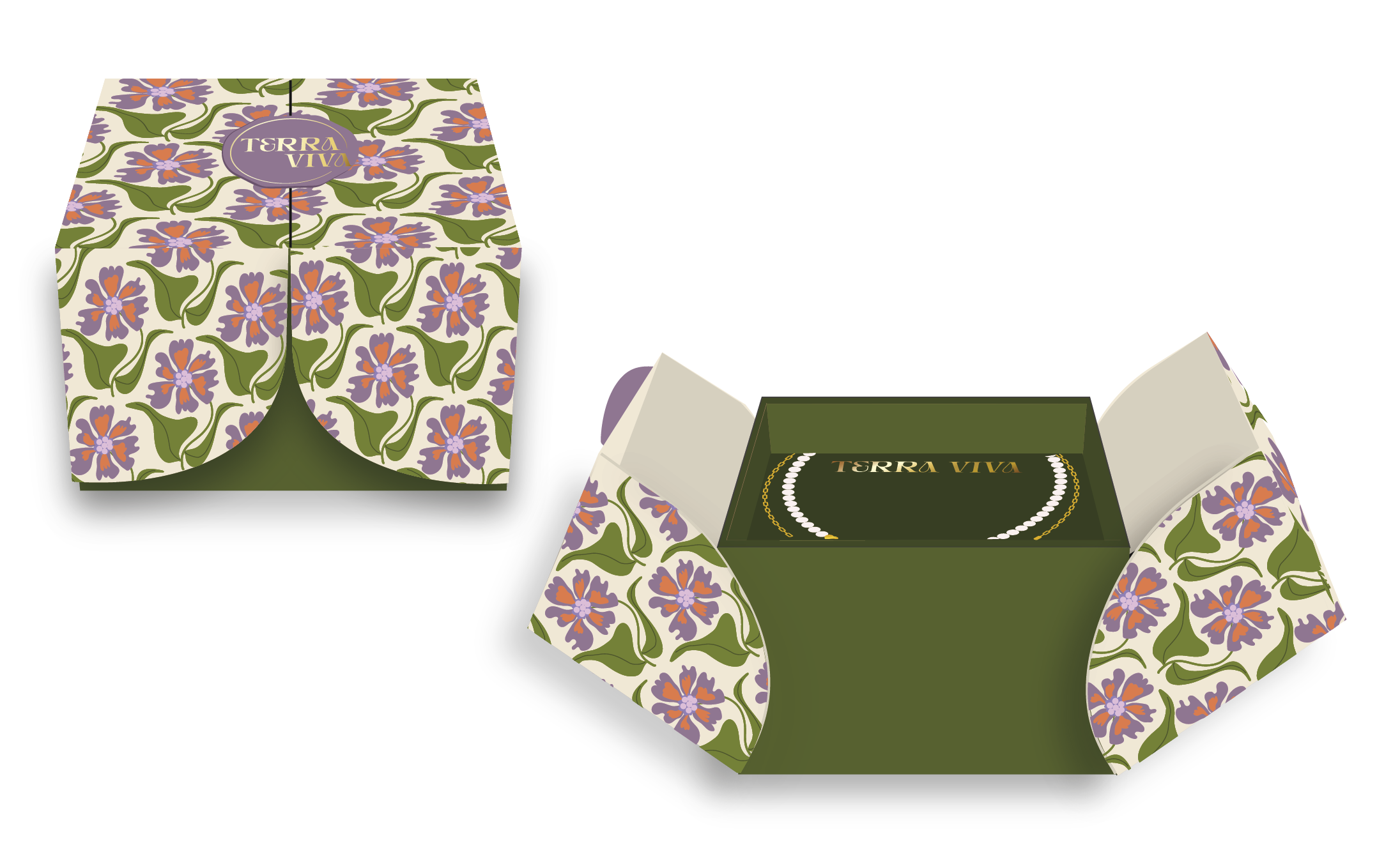
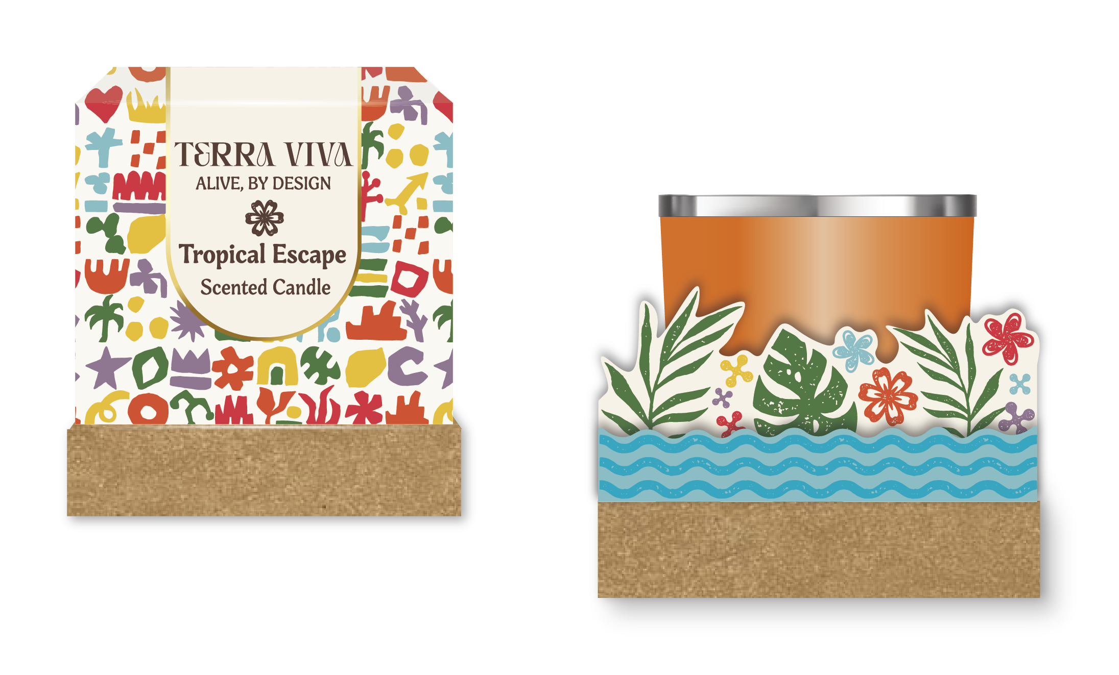
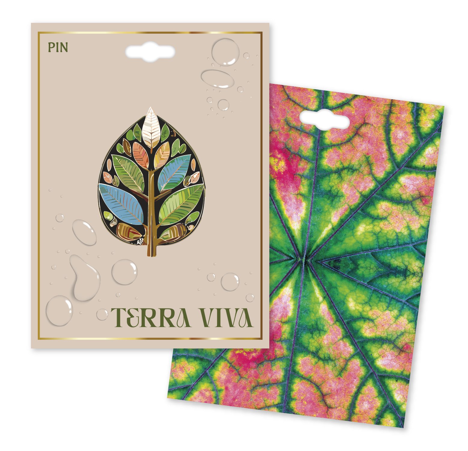
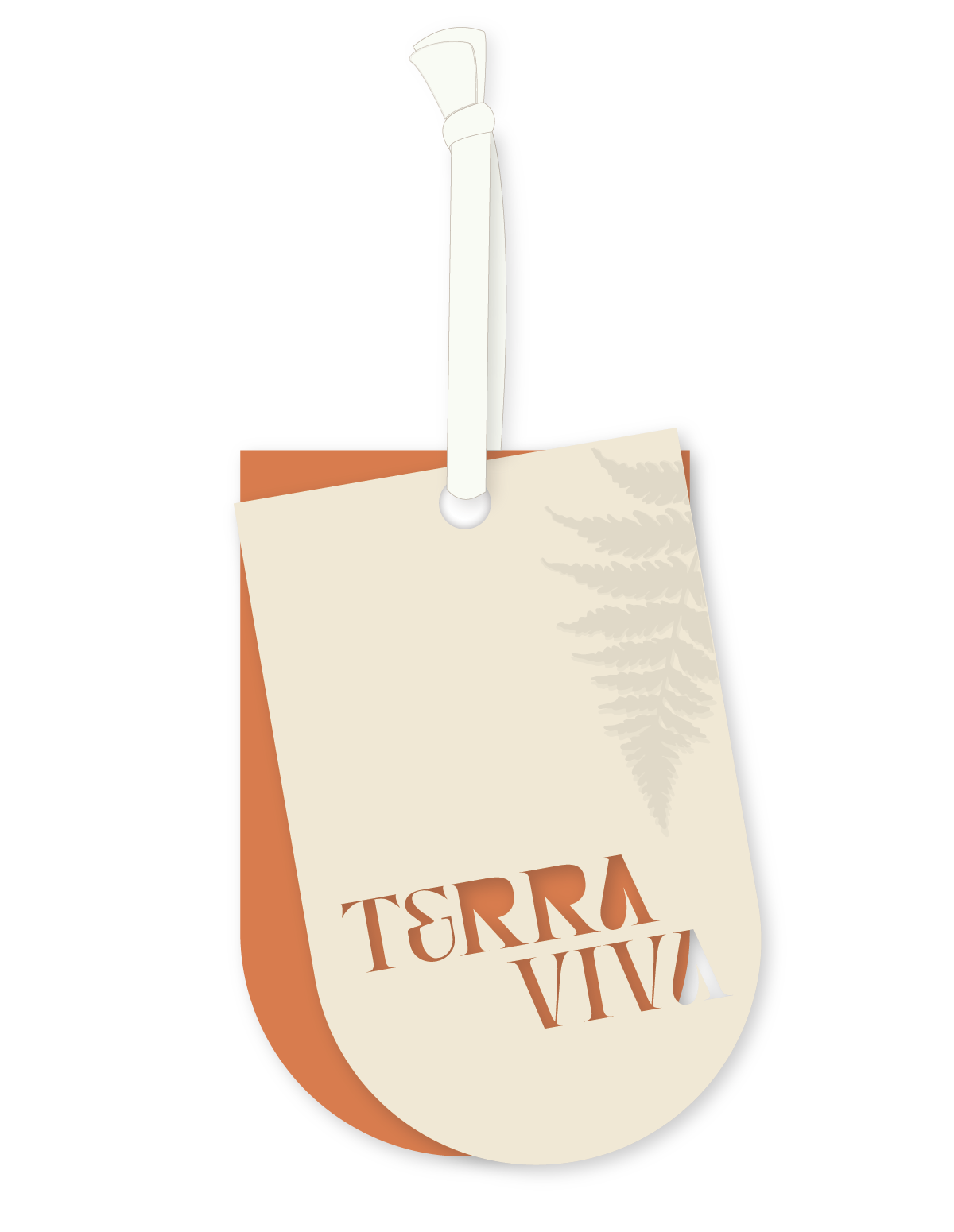
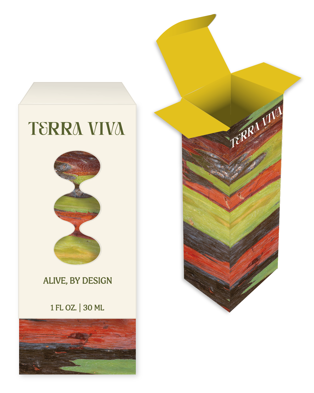
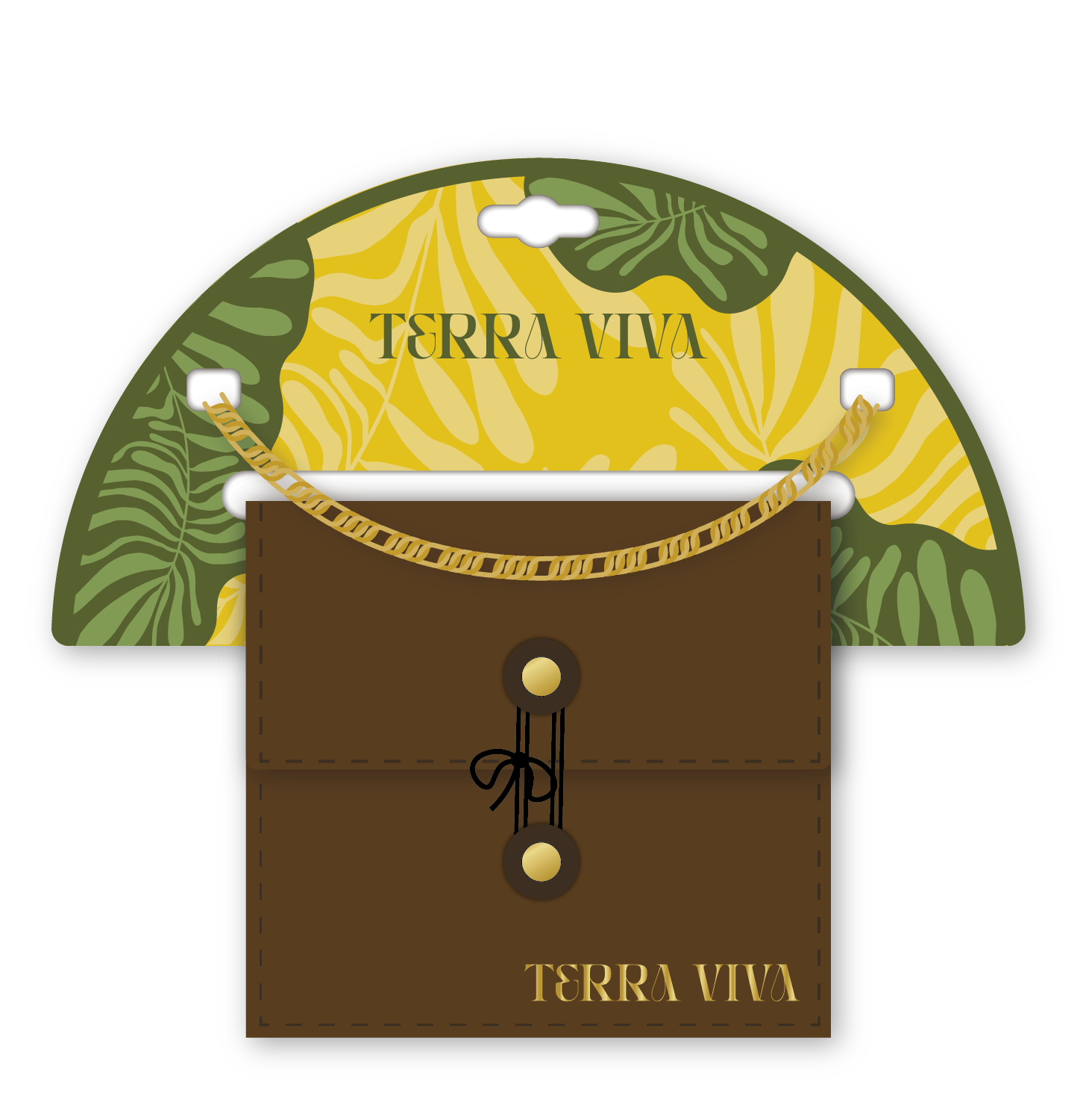
TERRA VIVA
ORGANIC
VIBRANT
RESILIENT
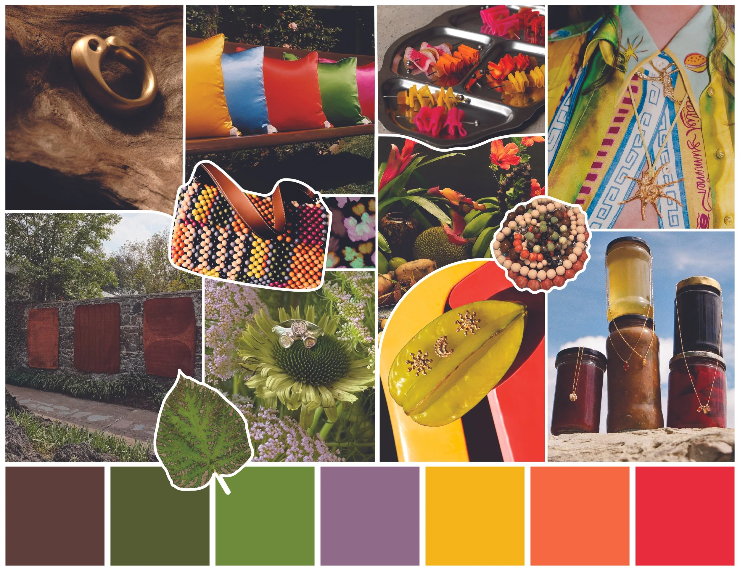
Terra Viva embodies a celebration of vitality and our innate connection to the natural world. Sensory rich sustainable materials like natural papers, cork and woven fabrics call back to artisan crafts and human resourcefulness, while also allowing us to feel responsibly engaged with our environment. These raw materials are brought to life with the use of vibrant ink printing in tropical patterns that infuse each piece with all the feelings of an island getaway, while also diving into the details of nature with vivid patterns of microscopic textures and plant life, allowing us to embrace the details of nature.

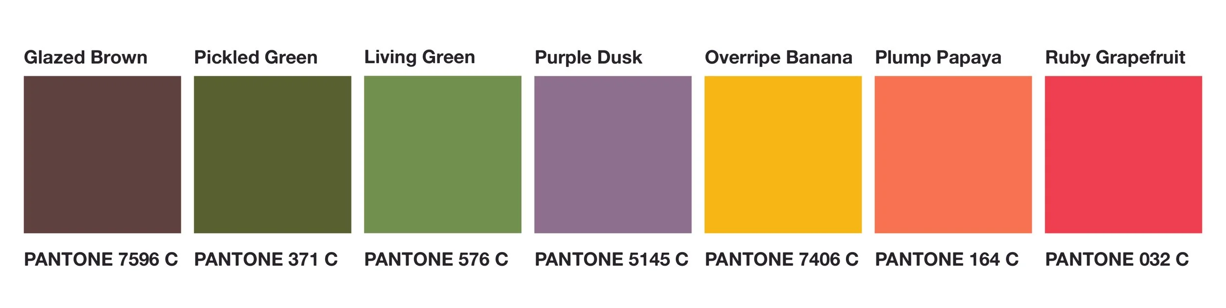
COLOR PALETTE
Terra Viva enlivened color palette radiates warmth, vitality, and tropical vibes. Drawing inspiration from the natural world, each shade feels truly alive with energy. While earthy green shades evoke a sense of rebirth and renewal, evocative brights like Plump Papaya and Ruby Grapefruit pack a fresh punch of joyous vibrancy.
Click to Download our Trend Presentation for More of our Designs!


COMMON THEMES
VISUAL MOVEMENT
BOLD USE OF COLOR
SURPRISING TEXTURES
Spring and Summer 2027’s trend stories are bursting with joyful expression, designed to uplift and inspire through energizing colorways, playful shapes, and invigorating textures. For this upcoming season, successful packaging will reflect the desire for creative freedom, authenticity, and human design. A dash of the unexpected acts as a tonic for burnout, offering consumers genuine engagement with products and brands alike.
CLICK TO SEE OUR OTHER PACKAGING TRENDS